Material 组件小部件
Flutter 提供了各种视觉、行为和动效丰富的小部件,它们实现了 Material 3 设计规范。Material 3 是 Flutter 的默认设计语言,能帮助你设计和构建美观、实用的应用程序,并可适应任何平台。
要查看这些及其他小部件的实际应用,请查看 Material 3 演示 Web 应用程序。
动作
#

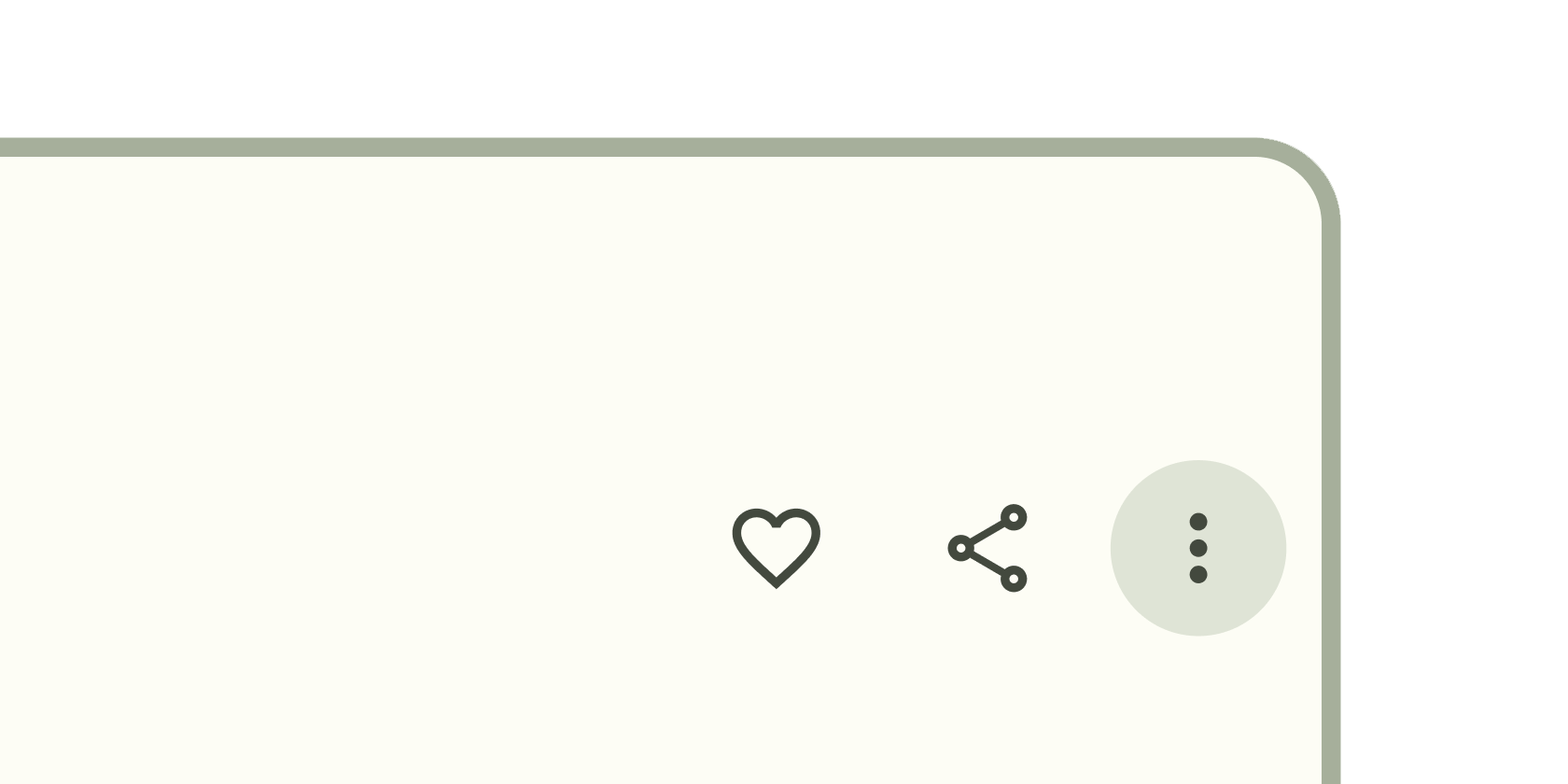
可点击的块,用于启动操作,例如发送电子邮件、共享文档或点赞评论。
包含图标的可点击块,始终保持关键操作触手可及。
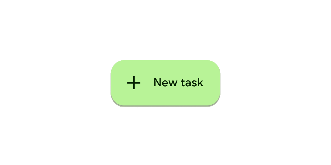
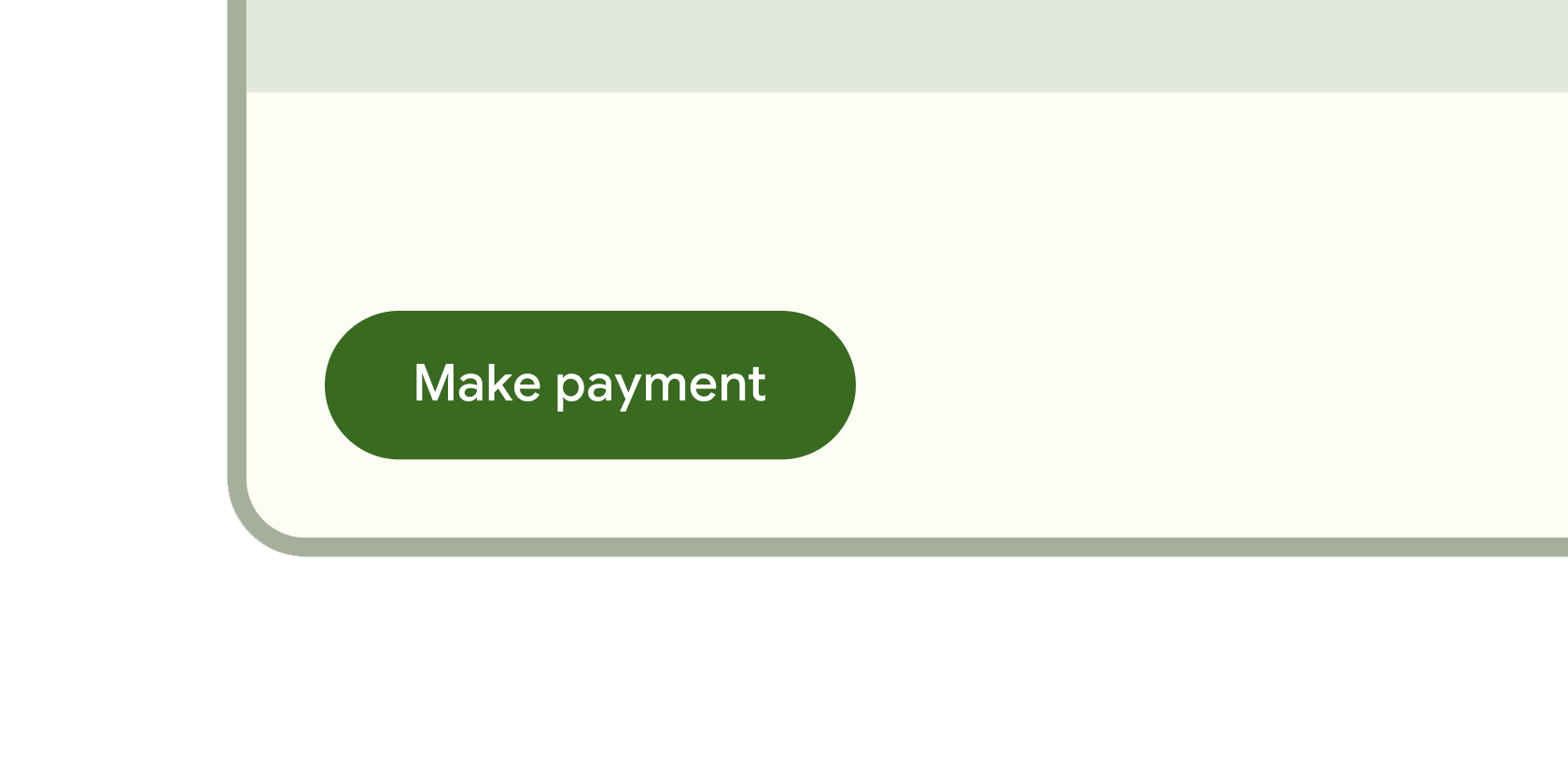
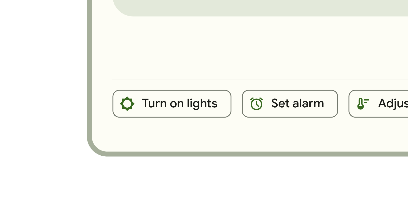
可触发动作的可点击块。这些更宽的块可以容纳文本标签并提供更大的目标区域。
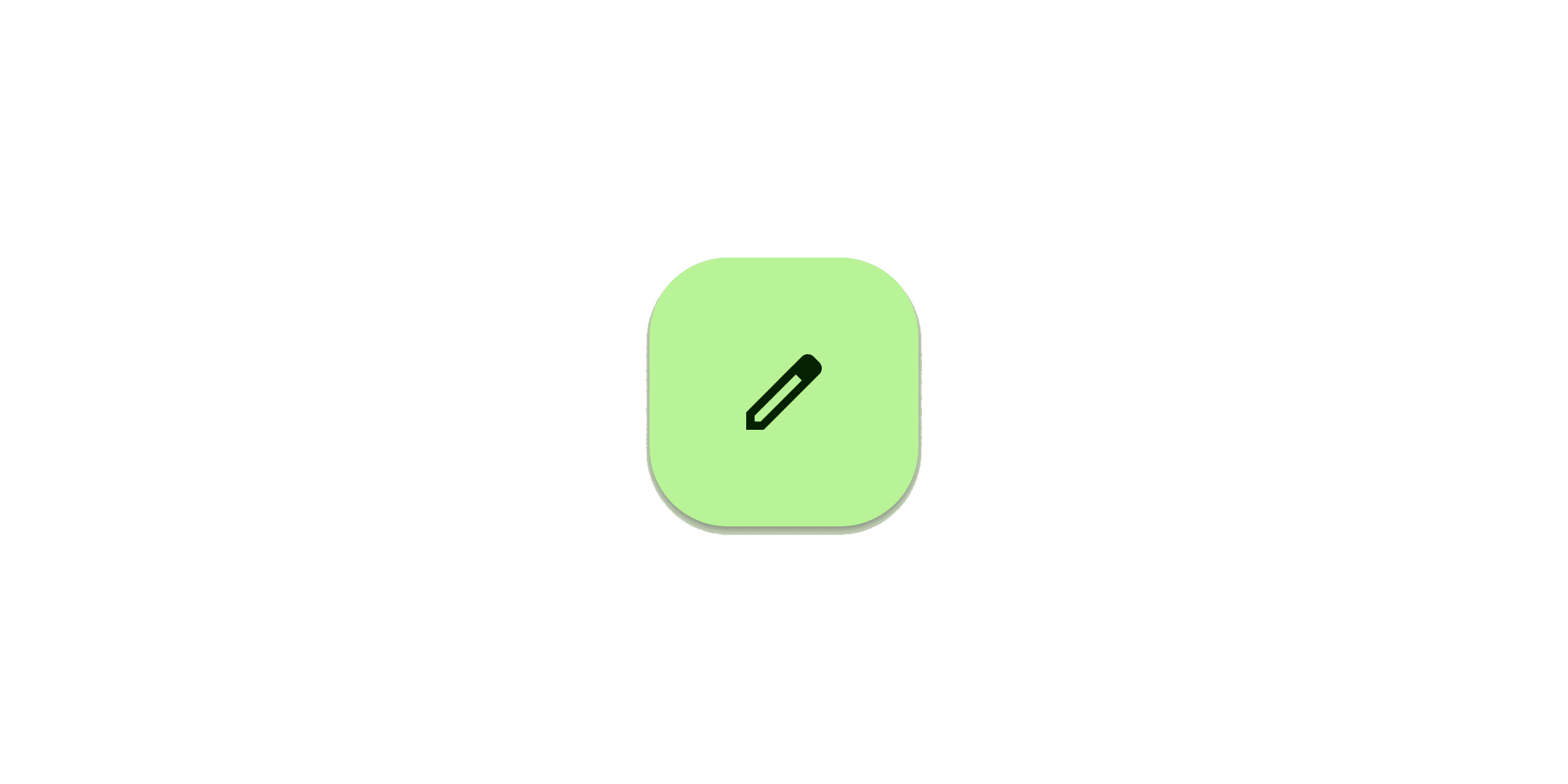
可点击的图标,用于提示应用用户执行补充操作。
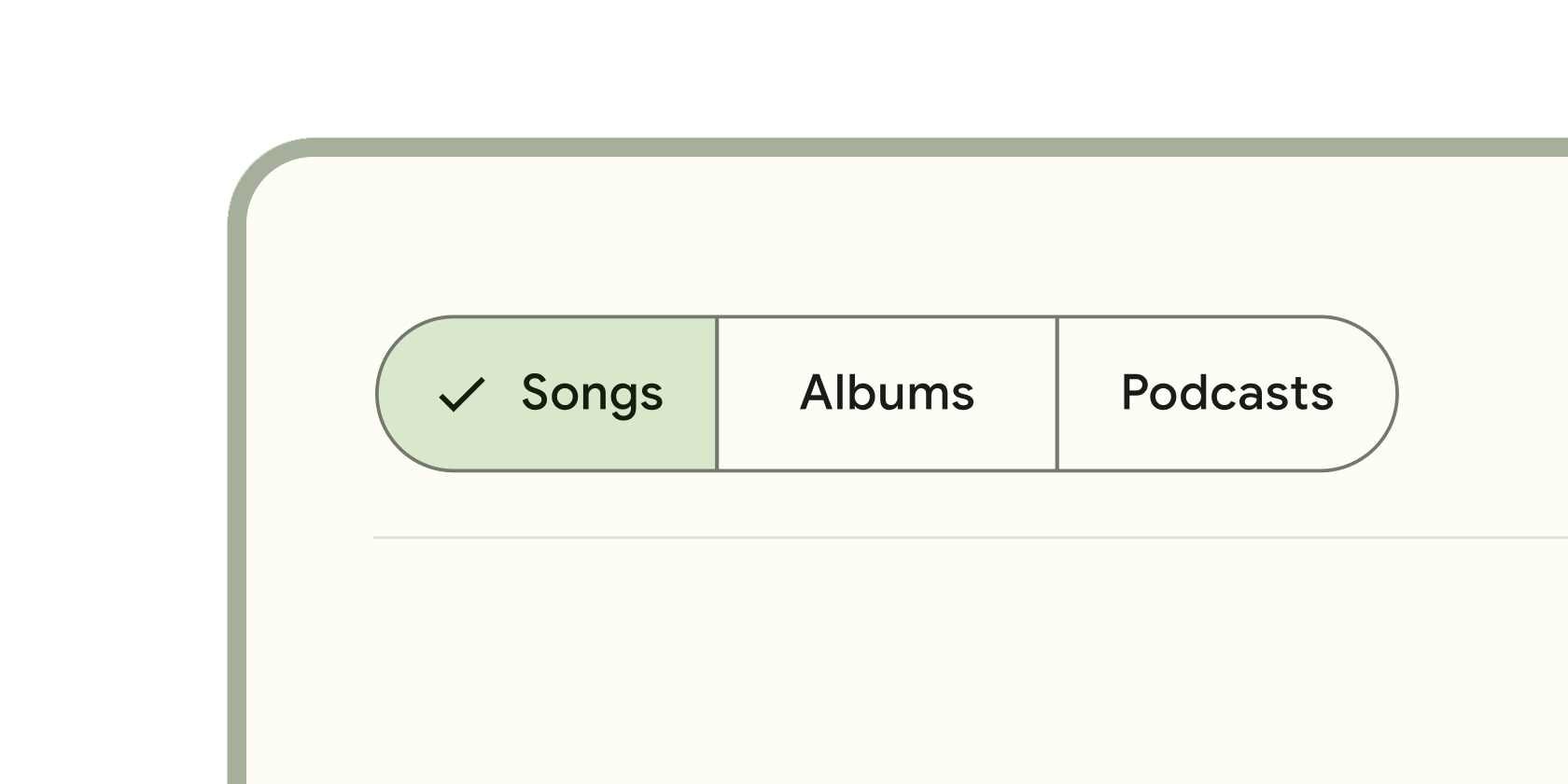
单个或多个可选择的可点击块,帮助人们选择选项、切换视图或排序元素。
通信
#

类似图标的块,用于传达动态内容,如计数或状态。可包含标签或数字。
随着正在进行的过程(例如加载应用程序或提交表单)完成而改变颜色的垂直线。
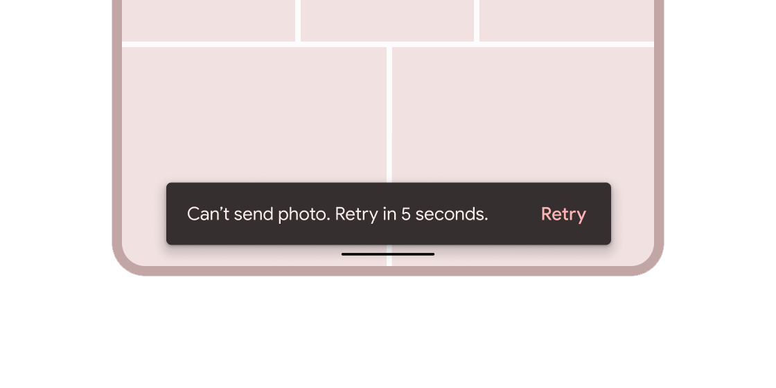
关于应用程序进程的简短消息,显示在屏幕底部。
容器
#
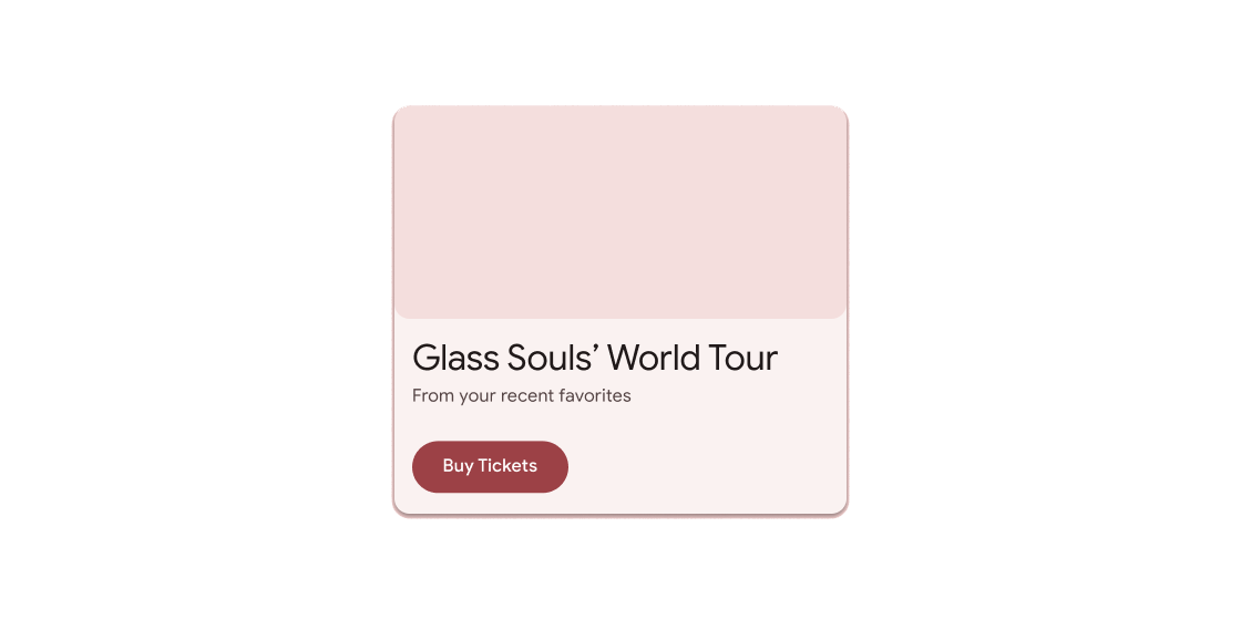
悬浮容器,提示应用程序用户提供更多数据或做出决策。
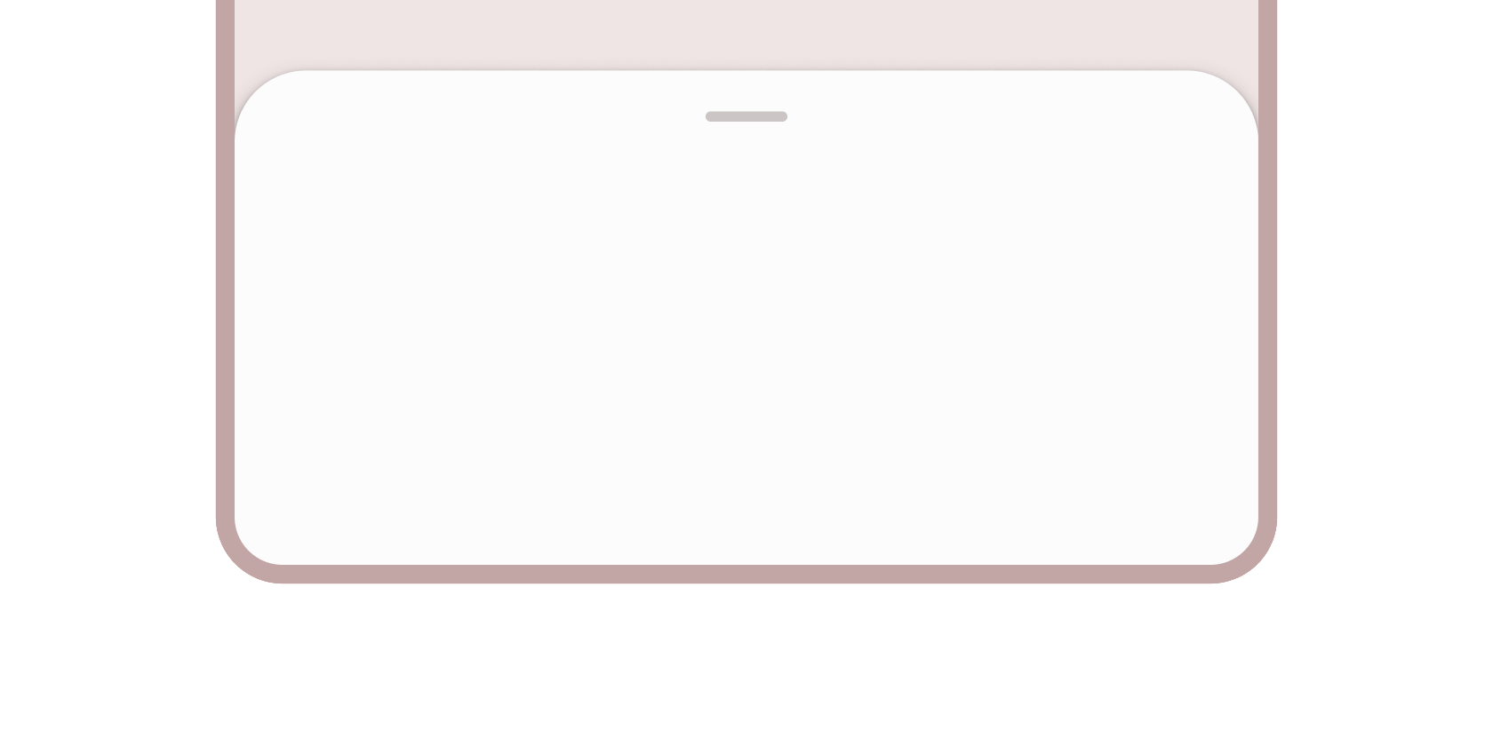
将补充内容固定在屏幕底部的容器。
用于容纳简短相关内容的容器,以圆角和阴影框显示。
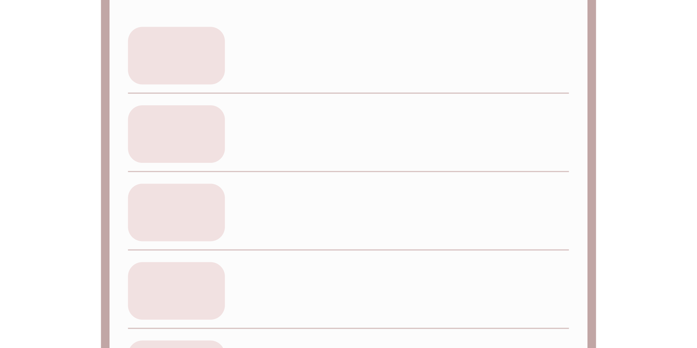
用于在列表和容器中对内容进行分组的细线。
单行固定高度的列表项,通常包含一些文本以及开头或结尾的图标。
导航
#

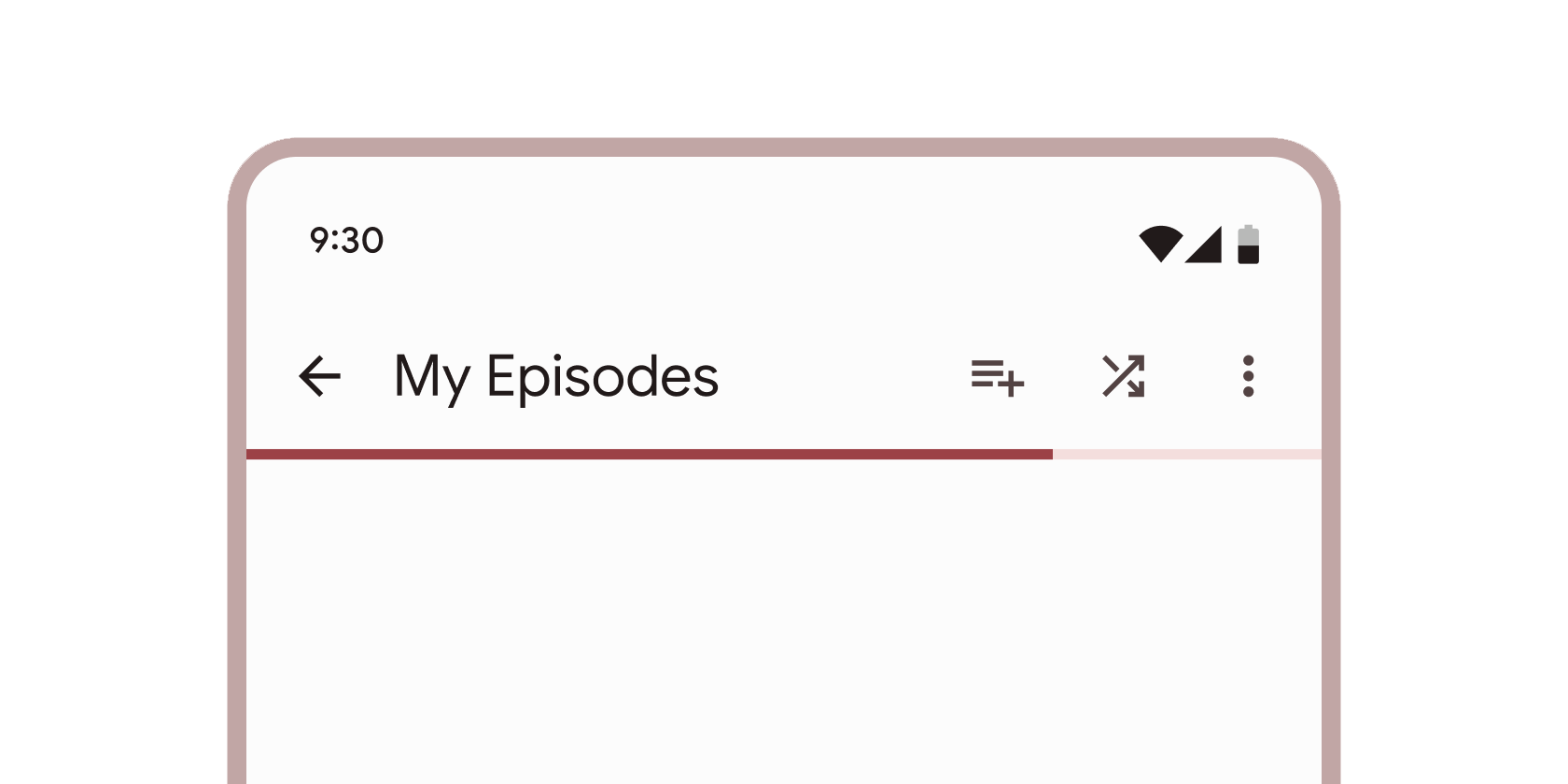
在屏幕顶部显示内容和操作的容器。
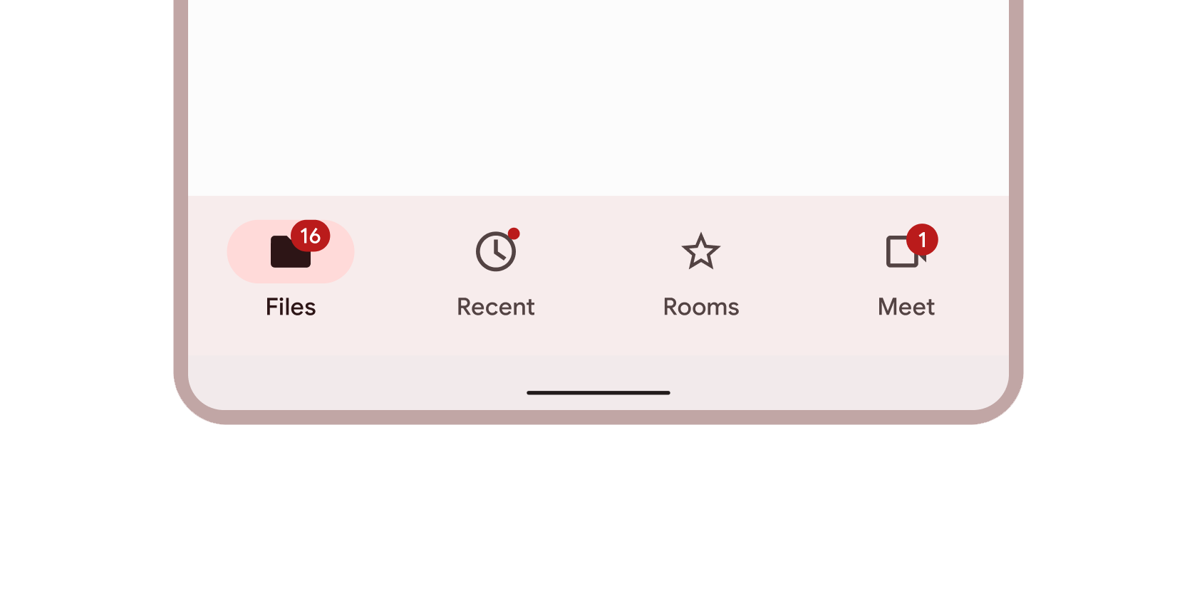
在屏幕底部显示导航和关键操作的容器。
持久容器,可用于在应用程序中切换主要目的地。
从应用程序左侧滑出,用于导航到应用程序其他部分的容器。
在平板电脑和桌面屏幕左侧的持久容器,用于导航到应用程序的各个部分。
分层容器,用于在不同的屏幕、数据集和其他交互之间组织内容。
选择
#
表单控件,应用程序用户可以设置或清除以从一组选项中选择一个或多个。
小块,简化信息输入、选择、内容过滤或触发操作。
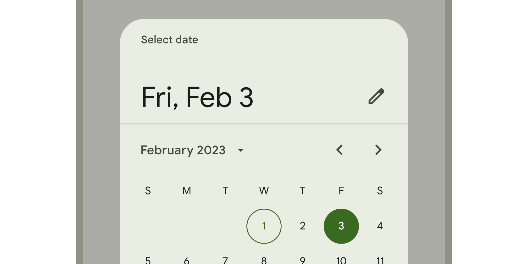
日历界面,用于选择日期或日期范围。
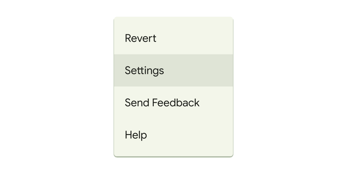
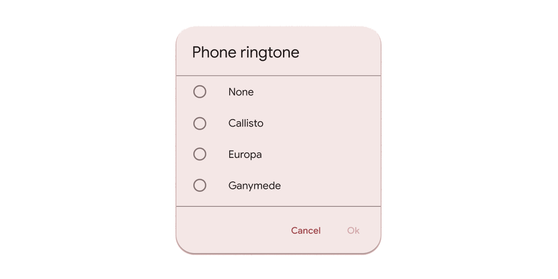
在临时表面上显示一系列选择的容器。
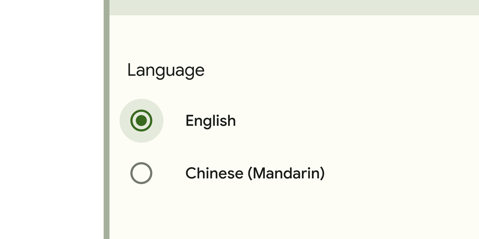
表单控件,应用程序用户可以设置或清除以从一组选项中仅选择一个。
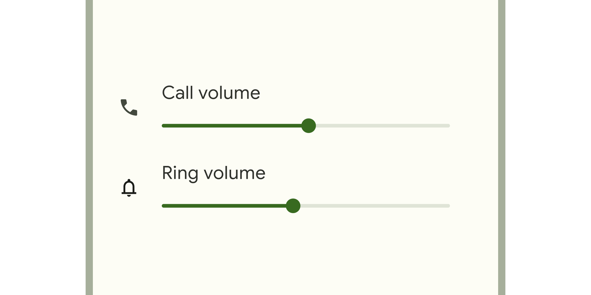
表单控件,用于选择值范围。
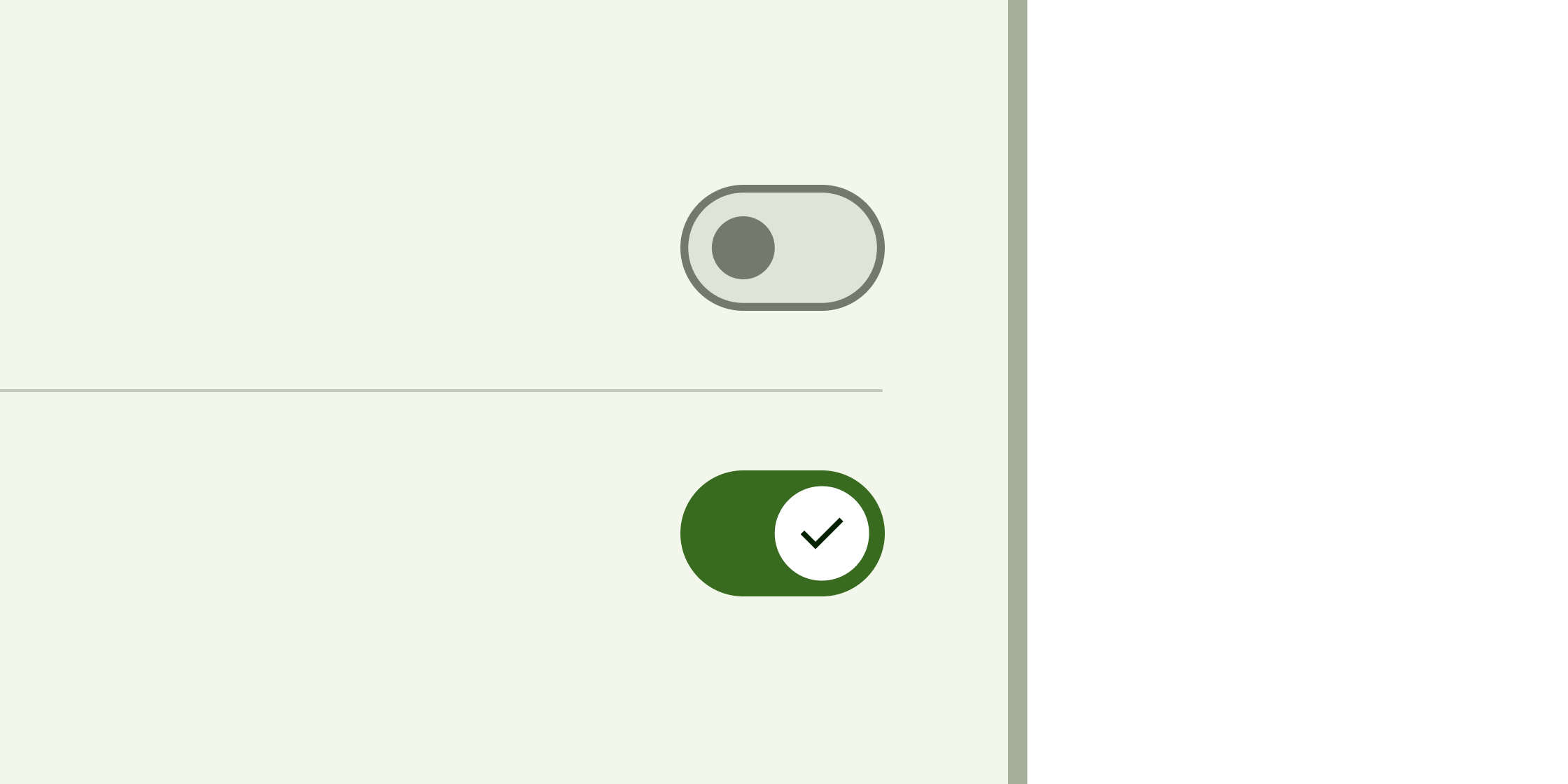
切换控件,将单个项目的状态更改为开或关。
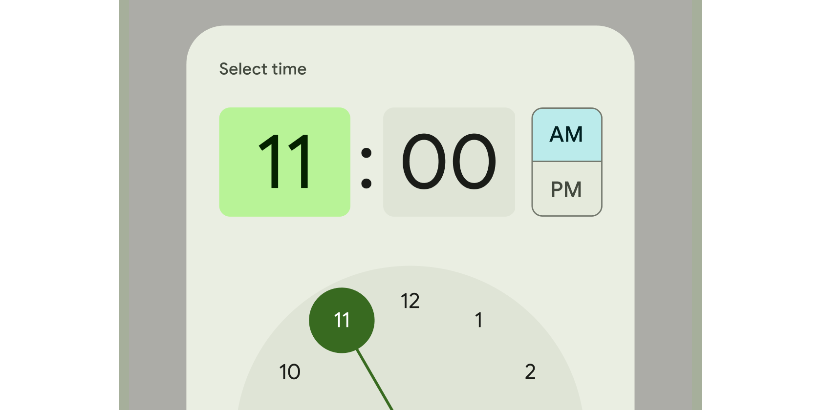
时钟界面,用于选择和设置特定时间。
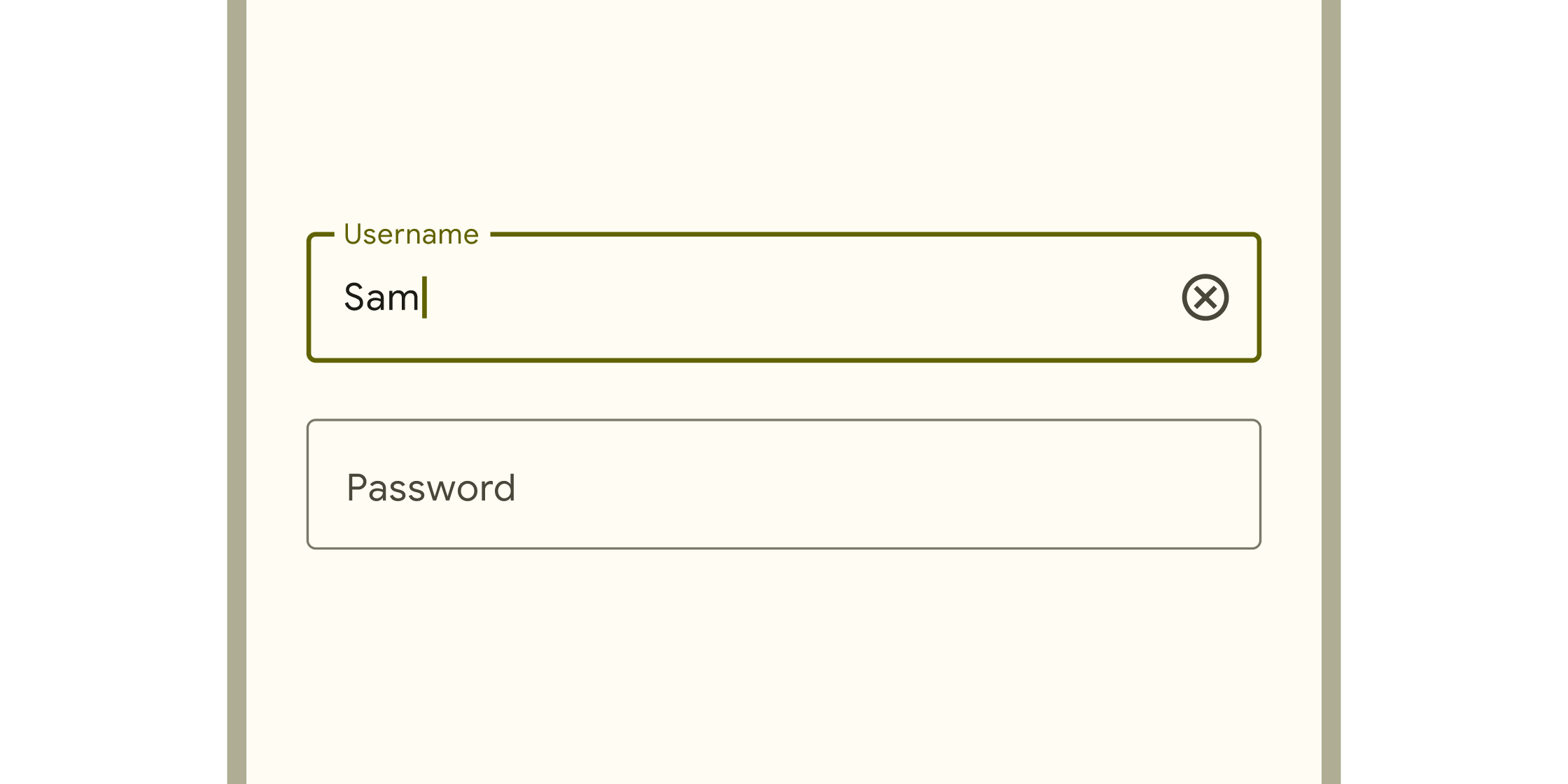
文本输入
#
在Material 2 小部件目录和小部件目录的其他类别中查找更多小部件。