Material 2 组件小部件
Flutter 提供了各种小部件,它们实现了 Material 2 设计指南,使您能够创建直观且美观的应用。
实现了 Material 2 设计指南的小部件。
应用结构和导航
#
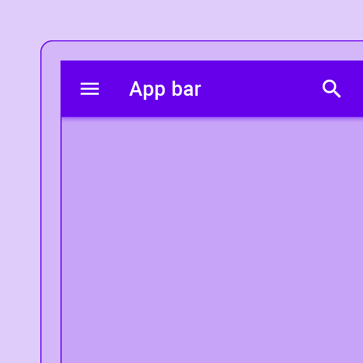
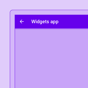
在屏幕顶部显示内容和操作的容器。
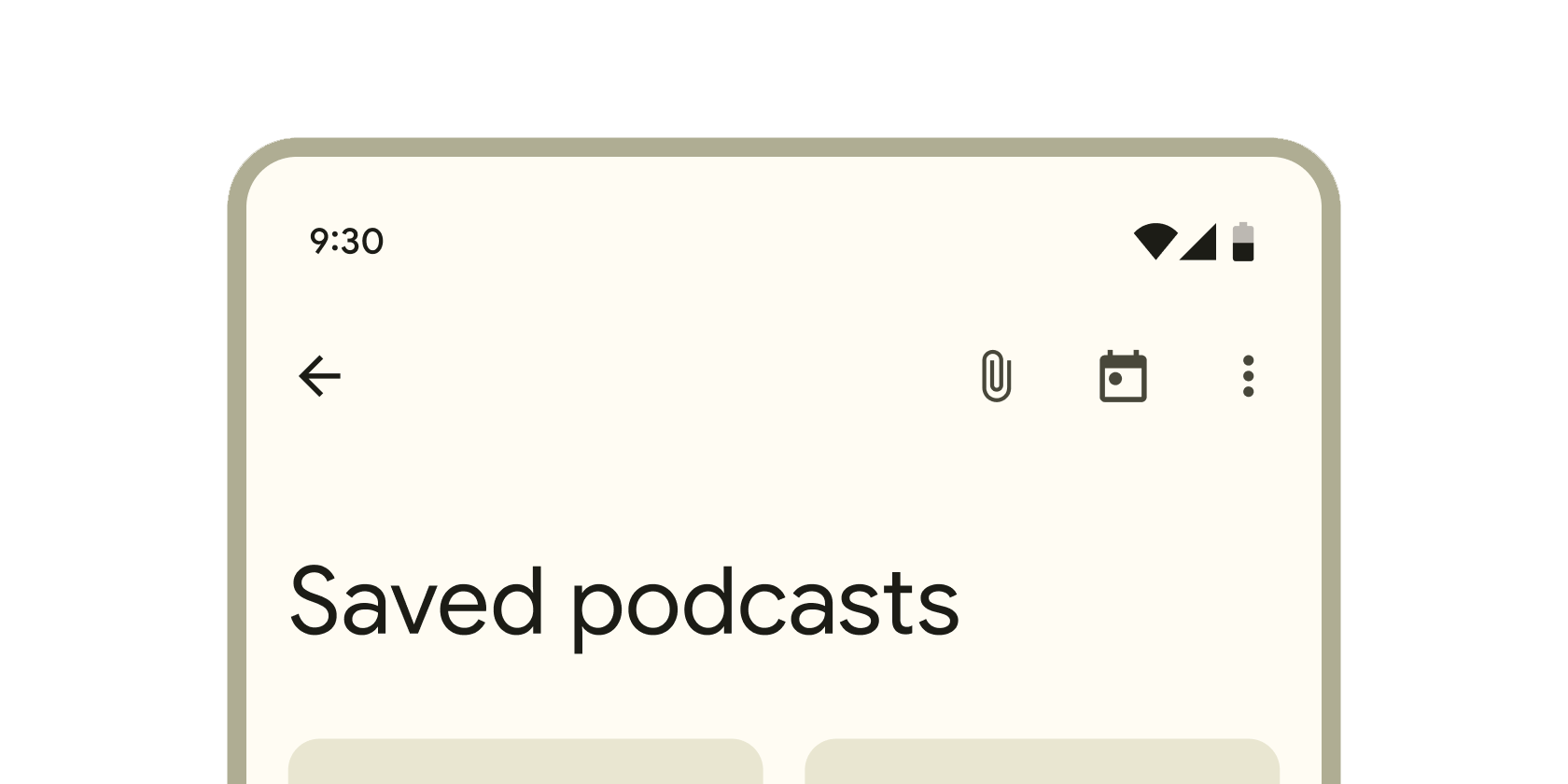
包含用于单点触控探索和在顶层视图之间切换的工具的容器。
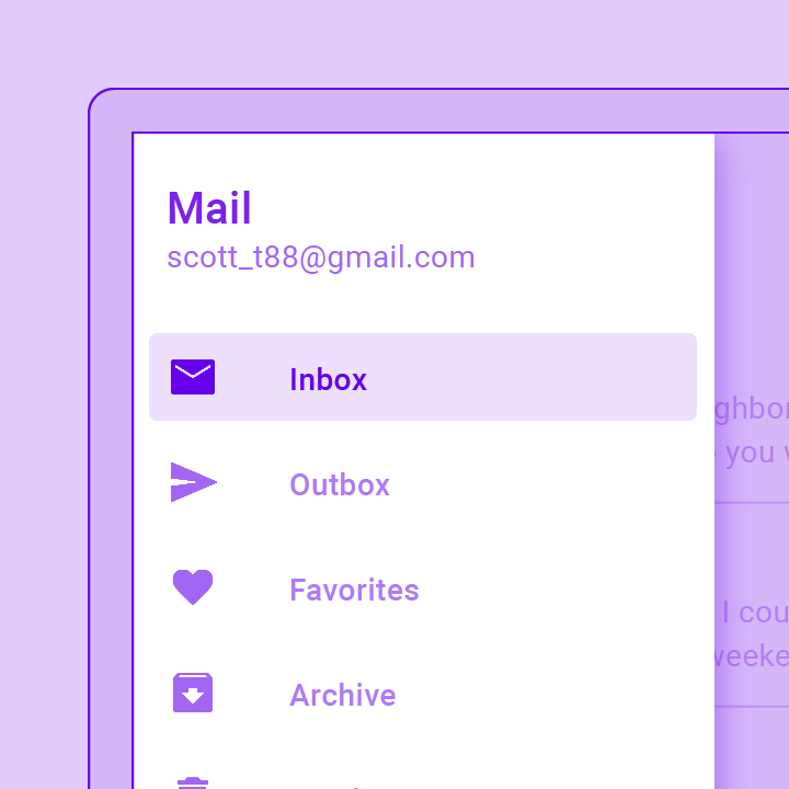
一个 Material Design 面板,从 Scaffold 的边缘水平滑入,以显示应用程序中的导航链接。

一个方便的小部件,包装了实现 Material Design 的应用程序通常需要的许多小部件。
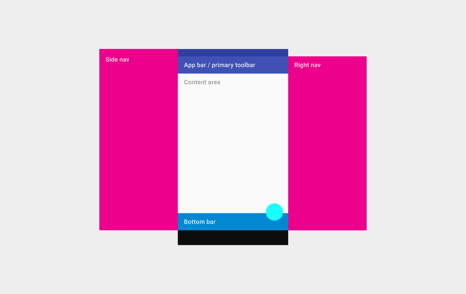
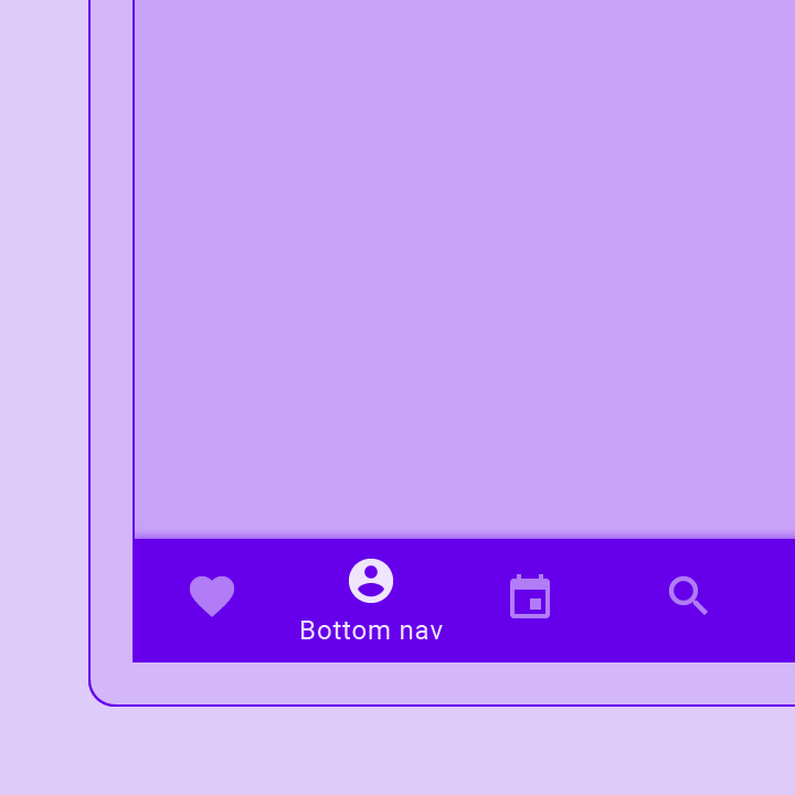
实现了基本的 Material Design 可视布局结构。此类提供了显示抽屉、SnackBar 和底部工作表的 API。
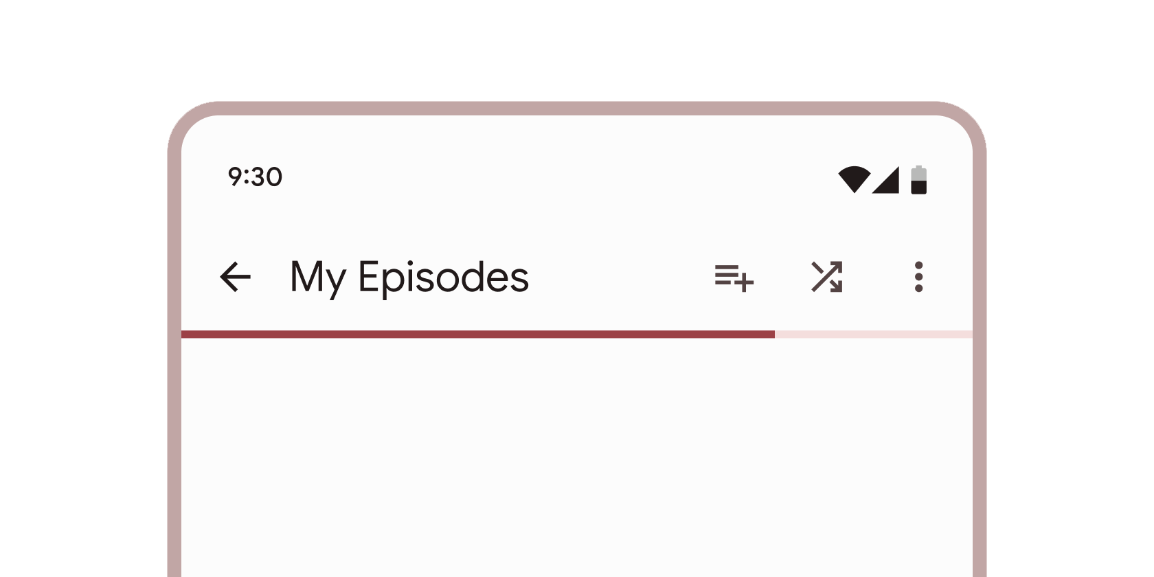
一个与 CustomScrollView 集成的 Material Design 应用栏。
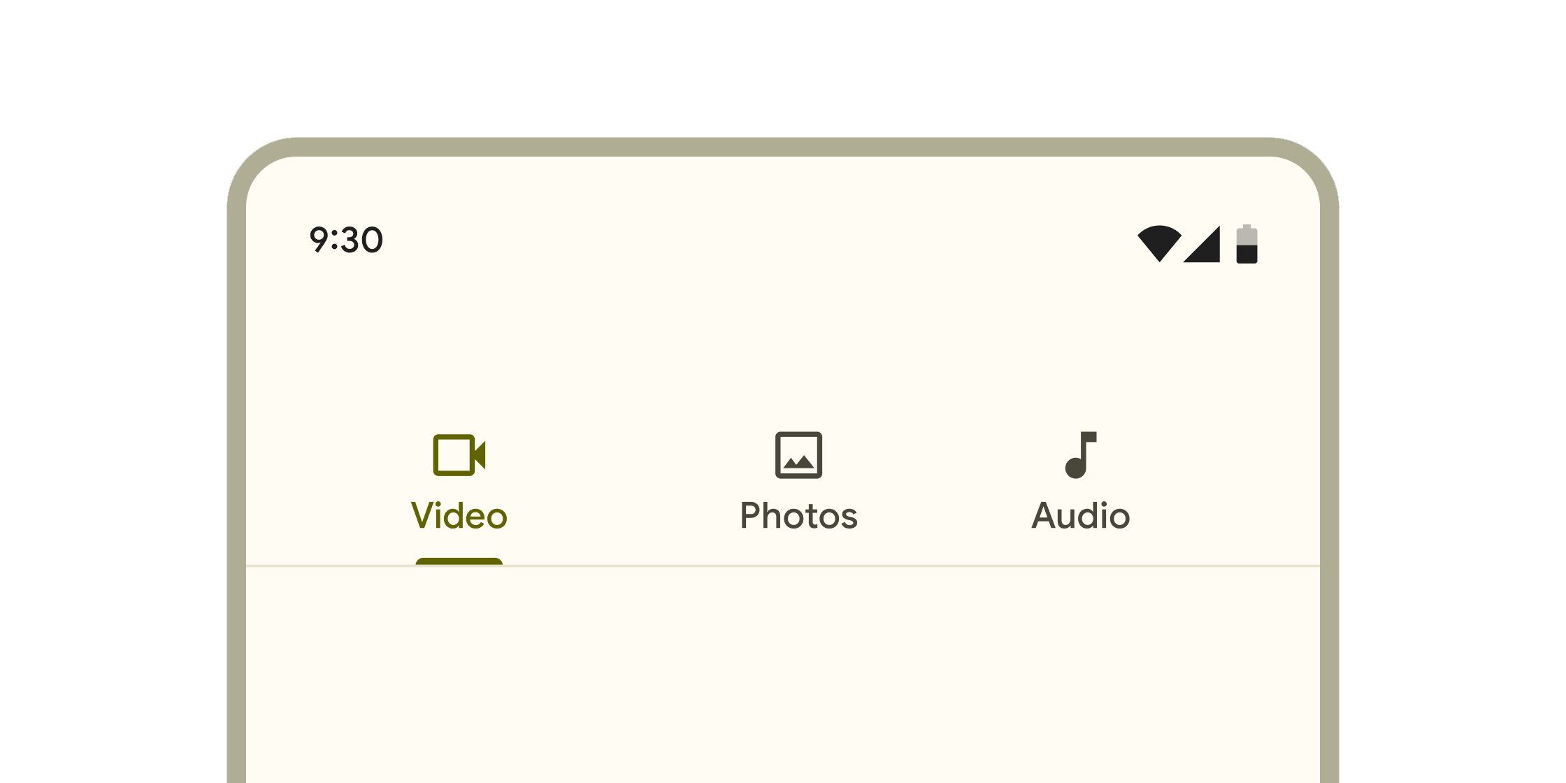
分层容器,用于跨不同屏幕、数据集和其他交互组织内容。
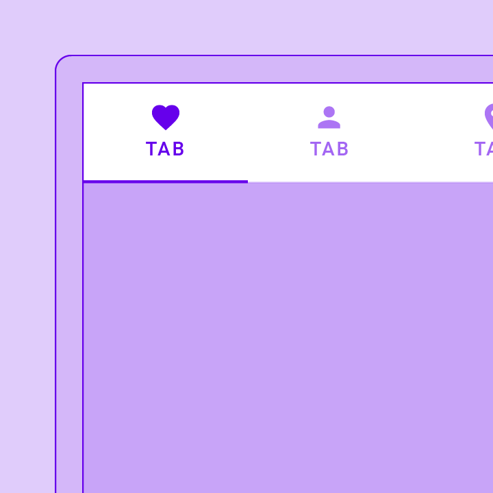
一个页面视图,显示与当前选定标签对应的窗口小部件。通常与 TabBar 结合使用。
协调 TabBar 和 TabBarView 之间的标签选择。
显示一排小的圆形指示器,每个标签一个。选定的标签的指示器会高亮显示。通常与 TabBarView 结合使用。
一个方便的类,包装了应用程序通常需要的许多小部件。
按钮
#
显示当前选定的项目和一个打开菜单以选择其他项目的箭头。
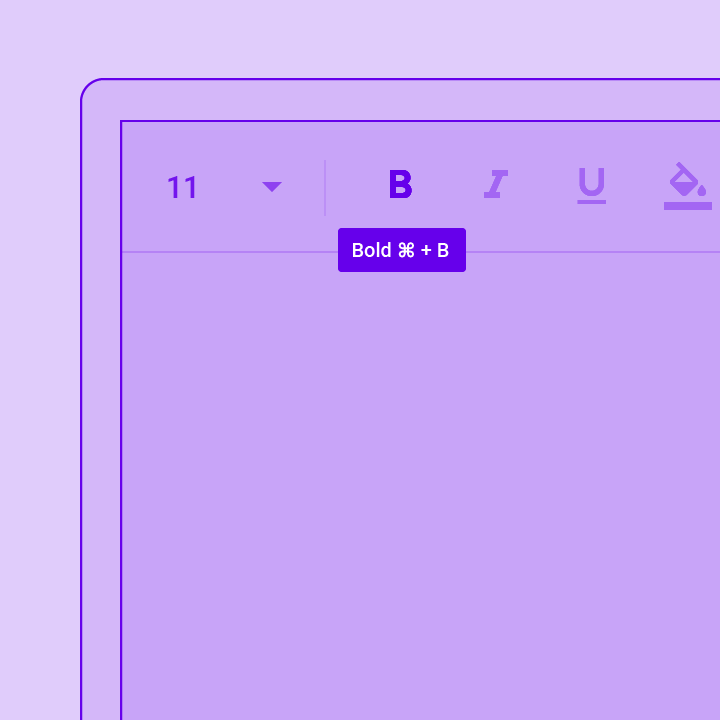
一个 Material Design 凸起按钮。一个填充的按钮,其材质在按下时会凸起。
包含一个图标的可点击块,该图标始终保持一个关键操作易于访问。
可触发操作的可点击块。这些较宽的块可以容纳文本标签并提供更大的目标区域。
可点击的图标,用于提示应用程序用户执行辅助操作。
一个 Material Design 边框按钮,本质上是一个带有边框的 TextButton。
按下时显示菜单,并在选中项目而关闭菜单时调用 onSelected。
一个 Material Design 文本按钮。一个简单的平面按钮,没有边框。
输入和选择
#
应用程序用户可以设置或清除表单控件,以从一组选项中选择一个或多个选项。
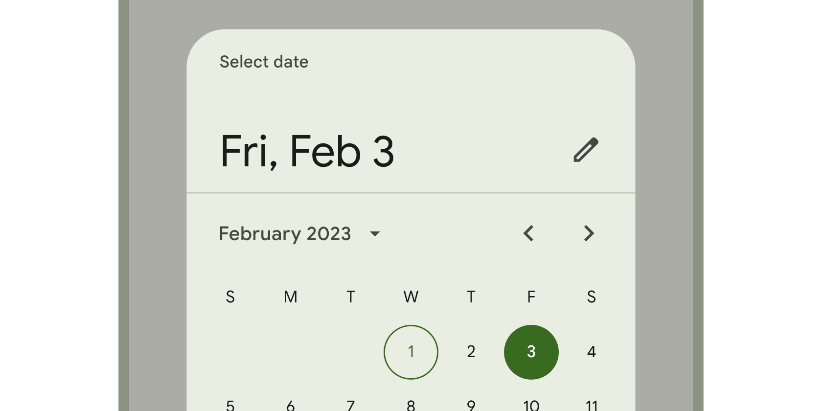
用于选择日期或日期范围的日历界面。
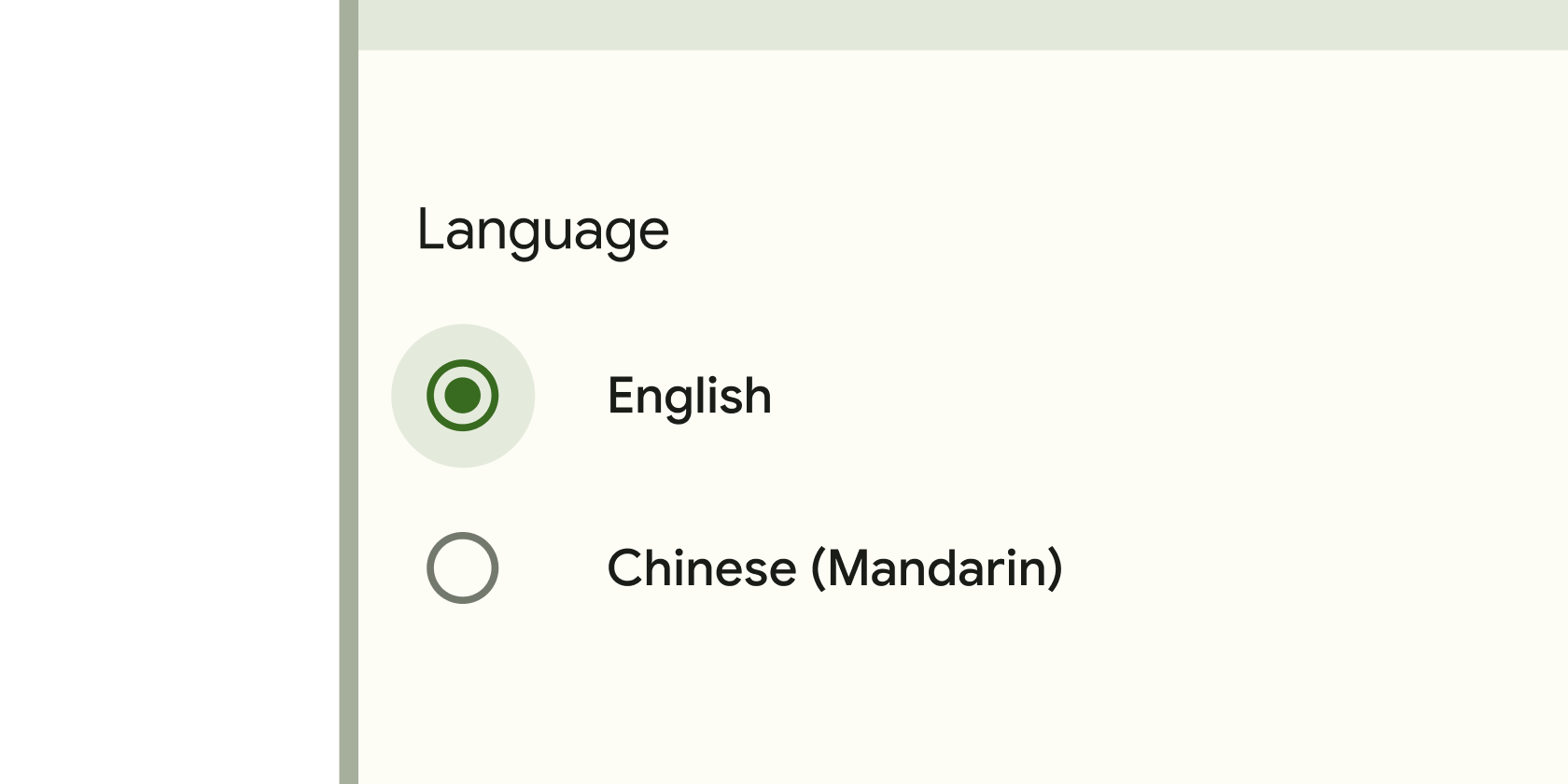
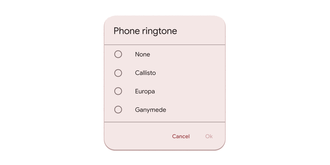
应用程序用户可以设置或清除表单控件,以从一组选项中仅选择一个选项。
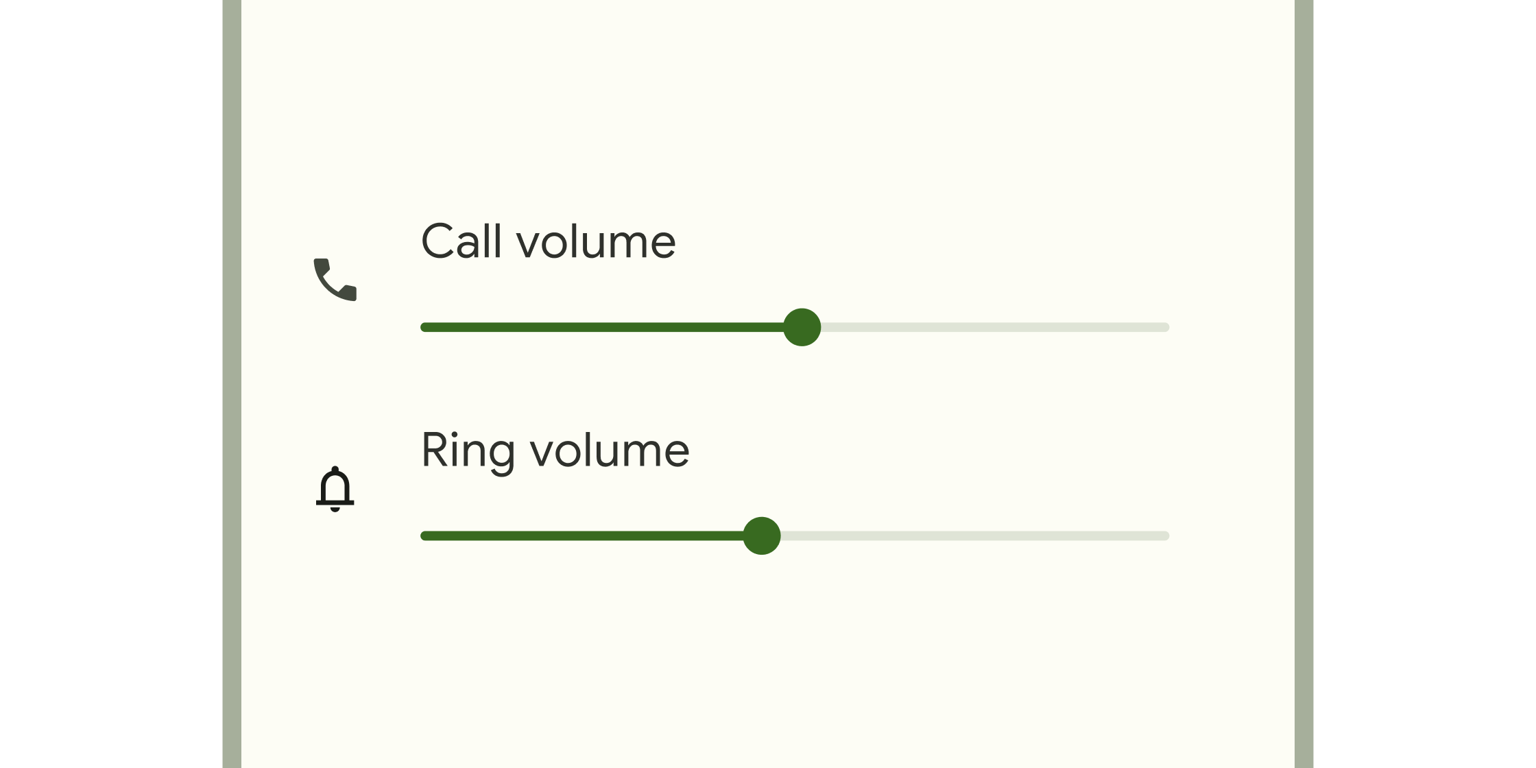
启用选择值范围的表单控件。
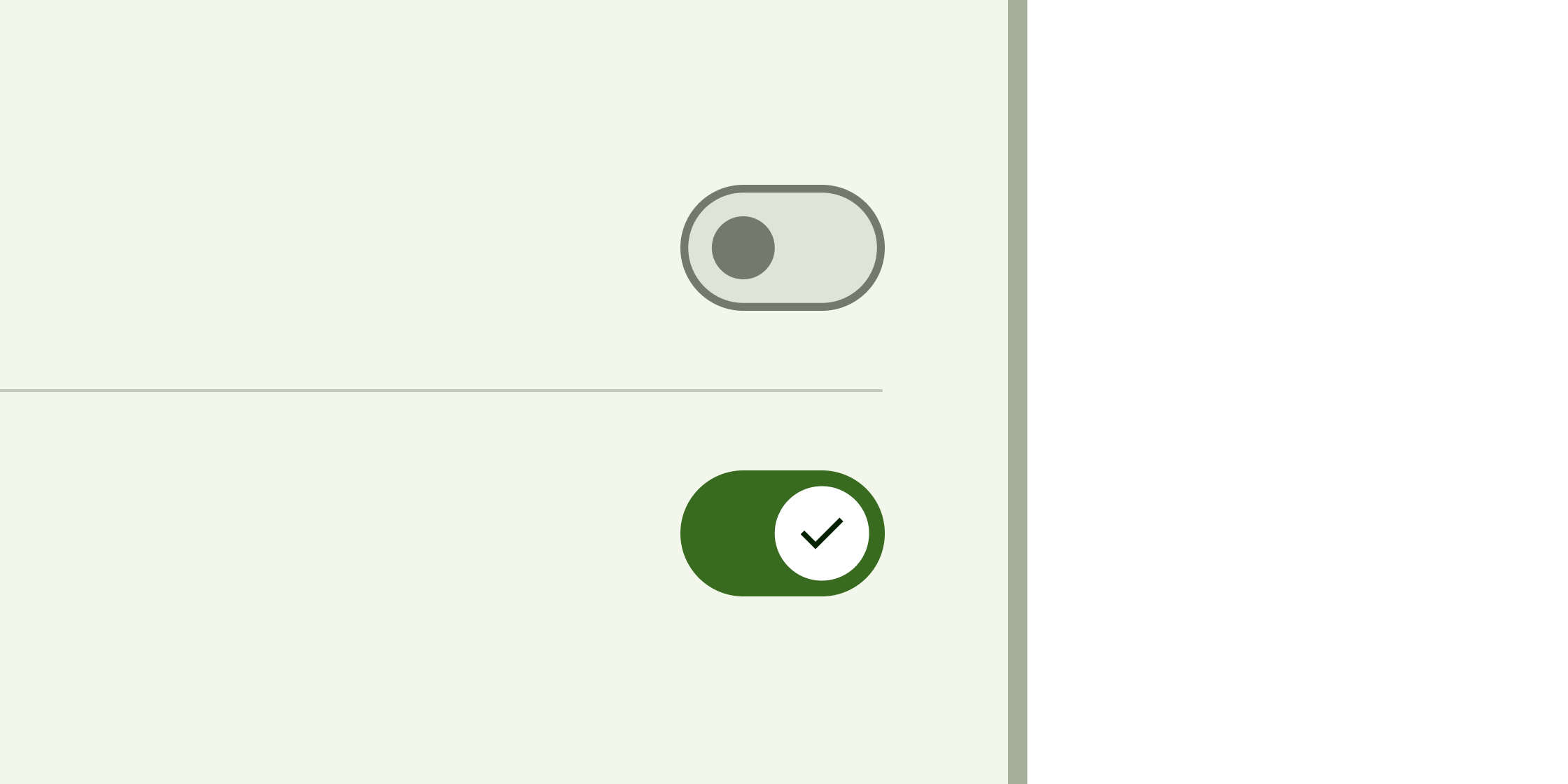
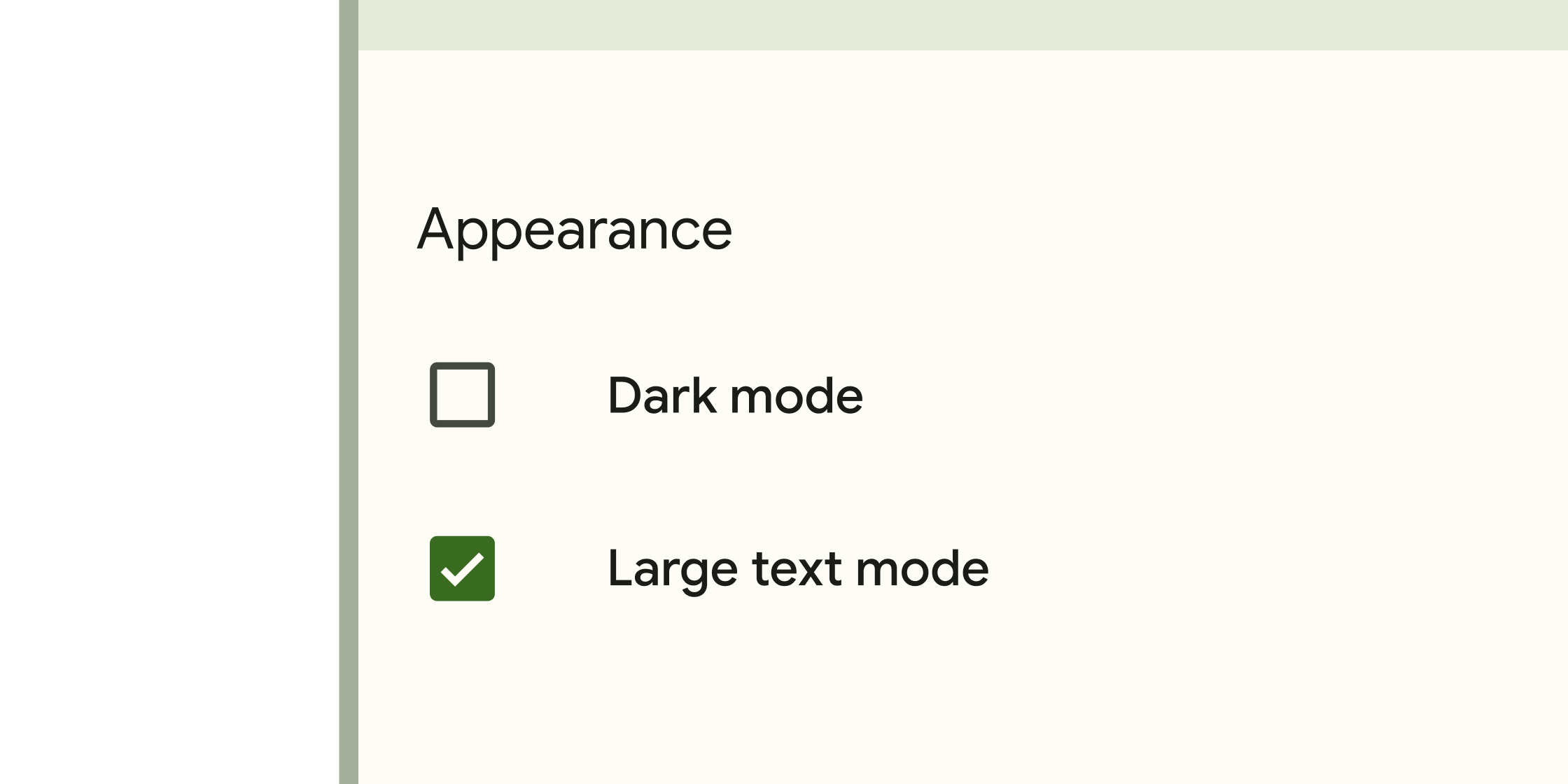
切换控件,用于将单个项目的状态从关闭切换到打开。
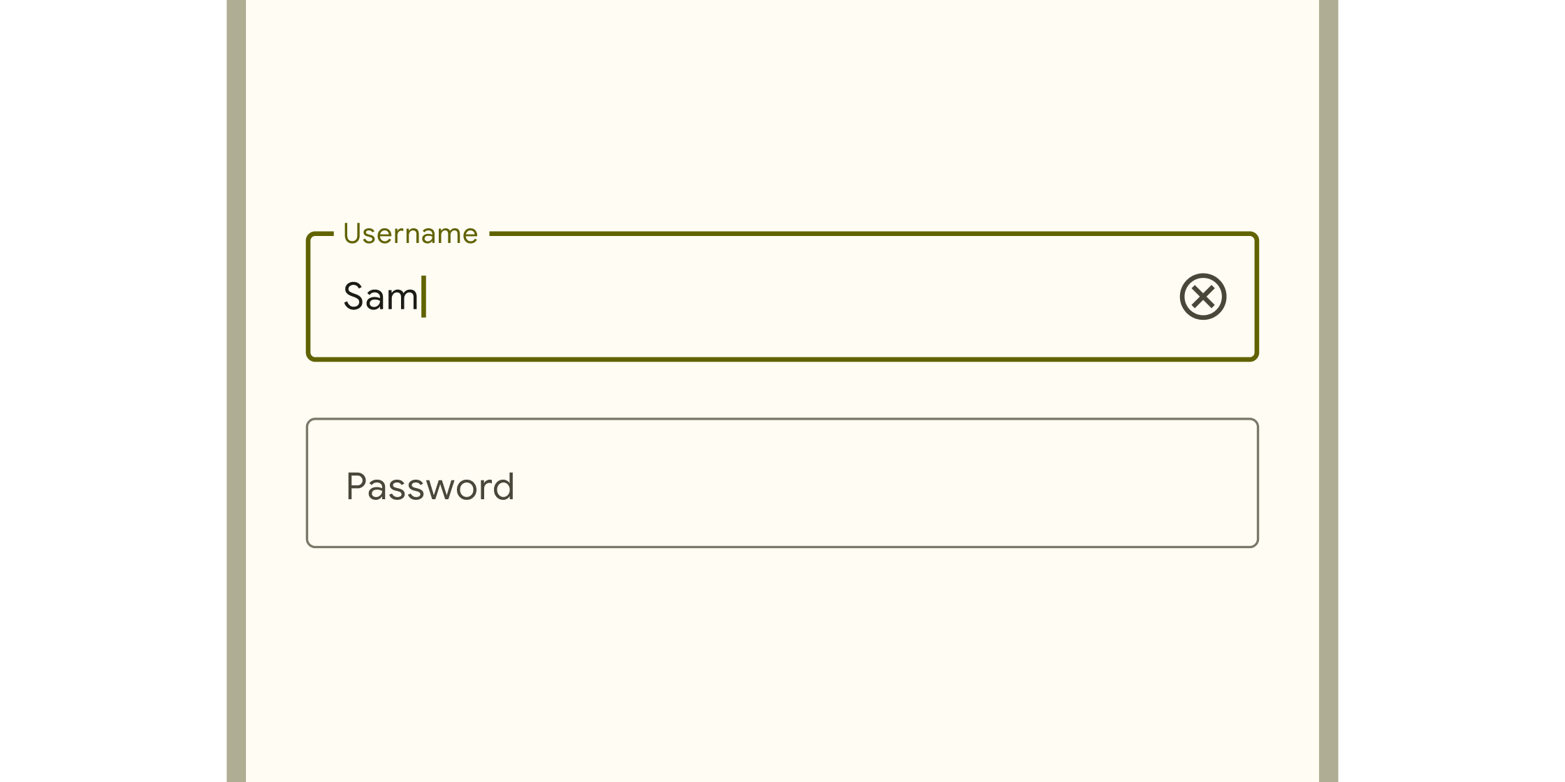
应用程序用户可以输入文本的框。它们出现在表单和对话框中。
对话框、警告和面板
#
悬停容器,用于提示应用程序用户提供更多数据或做出决定。

扩展面板包含创建流程,并允许对元素进行轻量级编辑。ExpansionPanel 小部件实现了此组件。
简单对话框可以提供有关列表项的附加详细信息或操作。例如,它们可以显示头像图标以阐明子文本或正交操作(例如...
关于应用程序进程的简短消息,显示在屏幕底部。
信息展示
#
用于显示在带圆角的盒子中并带有阴影的简短、相关内容的容器。
小型块,用于简化信息输入、做出选择、过滤内容或触发操作。
旋转以指示应用程序忙碌的圆形进度指示器。
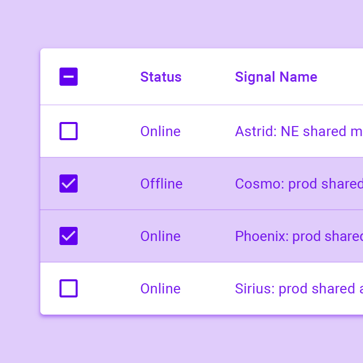
数据表显示原始数据集合。它们通常出现在桌面企业产品中。DataTable 小部件实现了此组件。
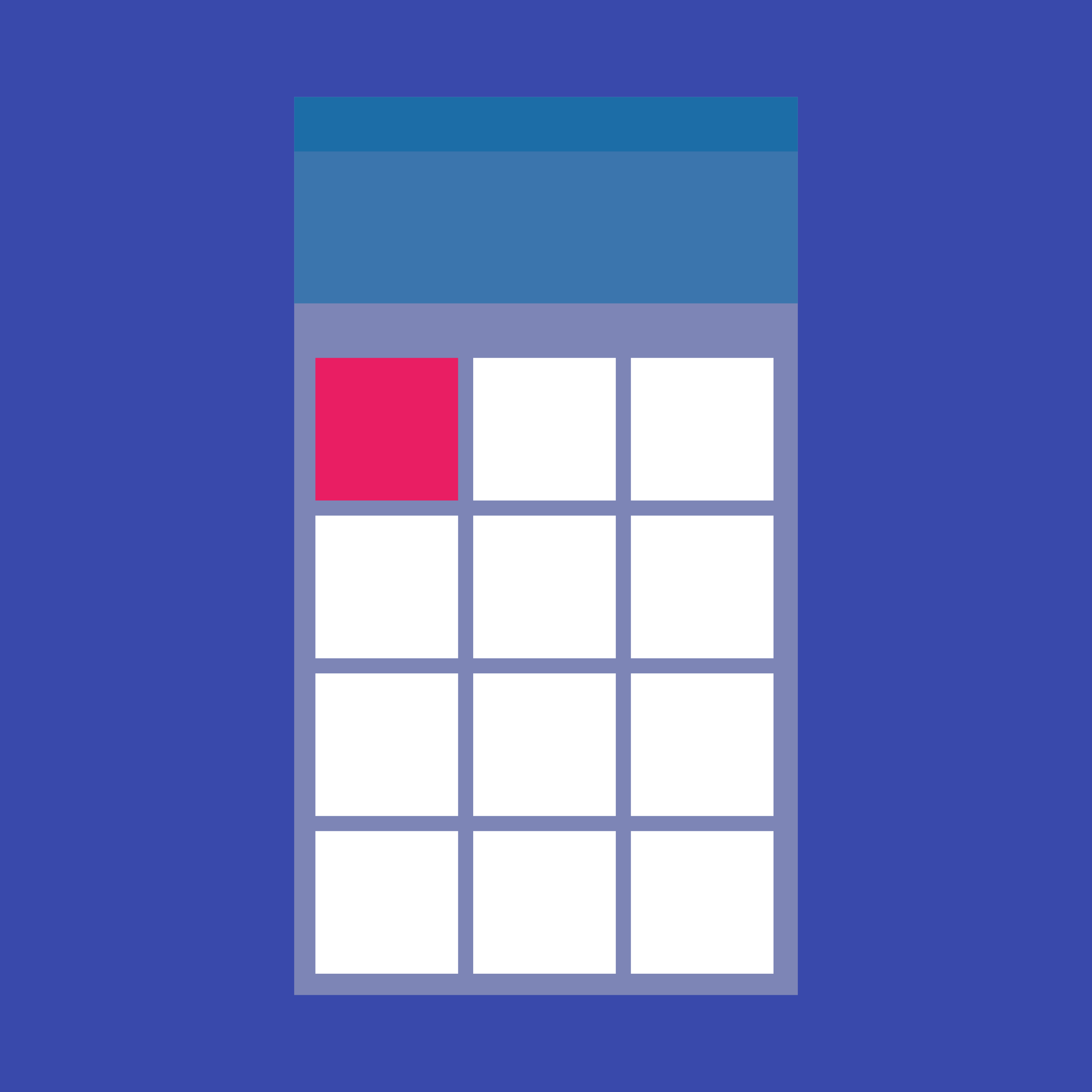
网格列表由垂直和水平布局排列的单元格的重复模式组成。GridView 小部件实现了此组件。
一个 Material Design 图标。
显示图像的小部件。
一条细线,在应用程序正在进行的过程中(例如加载应用程序或提交表单)完成时会改变颜色。
工具提示提供文本标签,有助于解释按钮或其他用户界面操作的功能。将按钮包装在 Tooltip 小部件中以...
布局
#
用于在列表和容器中组合内容的细线。
一个单行固定高度的行,通常包含一些文本以及前导或尾随图标。

一个 Material Design 步进器小部件,用于显示通过一系列步骤的进度。
在组件目录中查找更多组件。