创建打字指示器
现代聊天应用程序会在其他用户主动输入回复时显示指示器。这些指示器有助于防止您与对方之间发生快速且冲突的响应。在本食谱中,您将构建一个语音气泡式打字指示器,该指示器会进出视图进行动画。
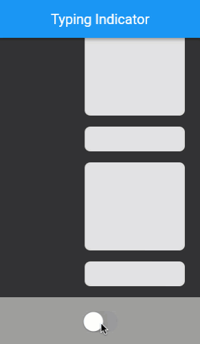
以下动画展示了应用程序的行为
定义打字指示器小部件
#打字指示器存在于自己的小部件中,以便可以在应用程序的任何地方使用。与任何控制动画的小部件一样,打字指示器需要是无状态小部件。该小部件接受一个布尔值,该值决定指示器是否可见。这种语音气泡式打字指示器接受气泡的颜色,以及大语音气泡内闪烁圆圈的亮色和暗色两种颜色。
定义一个名为 TypingIndicator 的新状态管理小部件。
class TypingIndicator extends StatefulWidget {
  const TypingIndicator({
    super.key,
    this.showIndicator = false,
    this.bubbleColor = const Color(0xFF646b7f),
    this.flashingCircleDarkColor = const Color(0xFF333333),
    this.flashingCircleBrightColor = const Color(0xFFaec1dd),
  });

  final bool showIndicator;
  final Color bubbleColor;
  final Color flashingCircleDarkColor;
  final Color flashingCircleBrightColor;

  @override
  State<TypingIndicator> createState() => _TypingIndicatorState();
}

class _TypingIndicatorState extends State<TypingIndicator> {
  @override
  Widget build(BuildContext context) {
    // TODO:
    return const SizedBox();
  }
}
为打字指示器留出空间
#当打字指示器未显示时,它不占用任何空间。因此,指示器在出现时需要增长高度,在消失时需要缩小高度。
打字指示器的高度可以是打字指示器内语音气泡的自然高度。然而,语音气泡会以弹性曲线扩展。如果这种弹性迅速将所有对话消息向上或向下推动,可能会显得非常刺眼。相反,打字指示器的高度会自行动画,在气泡出现之前平滑地展开。当气泡消失时,高度会平滑地收缩为零。这种行为需要为打字指示器的高度进行显式动画。
定义打字指示器高度的动画,然后将该动画值应用于打字指示器内的 SizedBox 小部件。
class _TypingIndicatorState extends State<TypingIndicator>
    with TickerProviderStateMixin {
  late AnimationController _appearanceController;
  late Animation<double> _indicatorSpaceAnimation;

  @override
  void initState() {
    super.initState();

    _appearanceController = AnimationController(vsync: this);

    _indicatorSpaceAnimation = CurvedAnimation(
      parent: _appearanceController,
      curve: const Interval(0.0, 0.4, curve: Curves.easeOut),
      reverseCurve: const Interval(0.0, 1.0, curve: Curves.easeOut),
    ).drive(Tween<double>(begin: 0.0, end: 60.0));

    if (widget.showIndicator) {
      _showIndicator();
    }
  }

  @override
  void didUpdateWidget(TypingIndicator oldWidget) {
    super.didUpdateWidget(oldWidget);

    if (widget.showIndicator != oldWidget.showIndicator) {
      if (widget.showIndicator) {
        _showIndicator();
      } else {
        _hideIndicator();
      }
    }
  }

  @override
  void dispose() {
    _appearanceController.dispose();
    super.dispose();
  }

  void _showIndicator() {
    _appearanceController
      ..duration = const Duration(milliseconds: 750)
      ..forward();
  }

  void _hideIndicator() {
    _appearanceController
      ..duration = const Duration(milliseconds: 150)
      ..reverse();
  }

  @override
  Widget build(BuildContext context) {
    return AnimatedBuilder(
      animation: _indicatorSpaceAnimation,
      builder: (context, child) {
        return SizedBox(height: _indicatorSpaceAnimation.value);
      },
    );
  }
}
TypingIndicator 根据传入的 showIndicator 变量是 true 还是 false,分别向前或向后运行动画。
控制高度的动画根据其方向使用不同的动画曲线。当动画向前移动时,需要快速为语音气泡腾出空间。因此,正向曲线在整个外观动画的前 40% 内运行整个高度动画。当动画反转时,它需要给语音气泡足够的时间在高度收缩之前消失。使用可用时间的缓出曲线是实现此行为的好方法。
为语音气泡设置动画
#打字指示器显示三个语音气泡。前两个气泡很小而且是圆形的。第三个气泡是长方形的,里面包含一些闪烁的圆圈。这些气泡从可用空间的左下角开始错开位置。
每个气泡通过将其缩放从 0% 动画到 100% 来显示,并且每个气泡以略微不同的时间出现,这样看起来就像每个气泡在前面的气泡之后出现。这被称为交错动画。
从左下角开始,以所需的颜色绘制三个气泡。然后,为气泡设置缩放动画,以便在 showIndicator 属性更改时,气泡交错出现。
class _TypingIndicatorState extends State<TypingIndicator>
    with TickerProviderStateMixin {
  late AnimationController _appearanceController;

  late Animation<double> _indicatorSpaceAnimation;

  late Animation<double> _smallBubbleAnimation;
  late Animation<double> _mediumBubbleAnimation;
  late Animation<double> _largeBubbleAnimation;

  late AnimationController _repeatingController;
  final List<Interval> _dotIntervals = const [
    Interval(0.25, 0.8),
    Interval(0.35, 0.9),
    Interval(0.45, 1.0),
  ];

  @override
  void initState() {
    super.initState();

    _appearanceController = AnimationController(vsync: this)
      ..addListener(() {
        setState(() {});
      });

    _indicatorSpaceAnimation = CurvedAnimation(
      parent: _appearanceController,
      curve: const Interval(0.0, 0.4, curve: Curves.easeOut),
      reverseCurve: const Interval(0.0, 1.0, curve: Curves.easeOut),
    ).drive(Tween<double>(begin: 0.0, end: 60.0));

    _smallBubbleAnimation = CurvedAnimation(
      parent: _appearanceController,
      curve: const Interval(0.0, 0.5, curve: Curves.elasticOut),
      reverseCurve: const Interval(0.0, 0.3, curve: Curves.easeOut),
    );
    _mediumBubbleAnimation = CurvedAnimation(
      parent: _appearanceController,
      curve: const Interval(0.2, 0.7, curve: Curves.elasticOut),
      reverseCurve: const Interval(0.2, 0.6, curve: Curves.easeOut),
    );
    _largeBubbleAnimation = CurvedAnimation(
      parent: _appearanceController,
      curve: const Interval(0.3, 1.0, curve: Curves.elasticOut),
      reverseCurve: const Interval(0.5, 1.0, curve: Curves.easeOut),
    );

    if (widget.showIndicator) {
      _showIndicator();
    }
  }

  @override
  void didUpdateWidget(TypingIndicator oldWidget) {
    super.didUpdateWidget(oldWidget);

    if (widget.showIndicator != oldWidget.showIndicator) {
      if (widget.showIndicator) {
        _showIndicator();
      } else {
        _hideIndicator();
      }
    }
  }

  @override
  void dispose() {
    _appearanceController.dispose();
    super.dispose();
  }

  void _showIndicator() {
    _appearanceController
      ..duration = const Duration(milliseconds: 750)
      ..forward();
  }

  void _hideIndicator() {
    _appearanceController
      ..duration = const Duration(milliseconds: 150)
      ..reverse();
  }

  @override
  Widget build(BuildContext context) {
    return AnimatedBuilder(
      animation: _indicatorSpaceAnimation,
      builder: (context, child) {
        return SizedBox(height: _indicatorSpaceAnimation.value, child: child);
      },
      child: Stack(
        children: [
          AnimatedBubble(
            animation: _smallBubbleAnimation,
            left: 8,
            bottom: 8,
            bubble: CircleBubble(size: 8, bubbleColor: widget.bubbleColor),
          ),
          AnimatedBubble(
            animation: _mediumBubbleAnimation,
            left: 10,
            bottom: 10,
            bubble: CircleBubble(size: 16, bubbleColor: widget.bubbleColor),
          ),
          AnimatedBubble(
            animation: _largeBubbleAnimation,
            left: 12,
            bottom: 12,
            bubble: StatusBubble(
              dotIntervals: _dotIntervals,
              flashingCircleDarkColor: widget.flashingCircleDarkColor,
              flashingCircleBrightColor: widget.flashingCircleBrightColor,
              bubbleColor: widget.bubbleColor,
            ),
          ),
        ],
      ),
    );
  }
}

class CircleBubble extends StatelessWidget {
  const CircleBubble({
    super.key,
    required this.size,
    required this.bubbleColor,
  });

  final double size;
  final Color bubbleColor;

  @override
  Widget build(BuildContext context) {
    return Container(
      width: size,
      height: size,
      decoration: BoxDecoration(shape: BoxShape.circle, color: bubbleColor),
    );
  }
}

class AnimatedBubble extends StatelessWidget {
  const AnimatedBubble({
    super.key,
    required this.animation,
    required this.left,
    required this.bottom,
    required this.bubble,
  });

  final Animation<double> animation;
  final double left;
  final double bottom;
  final Widget bubble;

  @override
  Widget build(BuildContext context) {
    return Positioned(
      left: left,
      bottom: bottom,
      child: AnimatedBuilder(
        animation: animation,
        builder: (context, child) {
          return Transform.scale(
            scale: animation.value,
            alignment: Alignment.bottomLeft,
            child: child,
          );
        },
        child: bubble,
      ),
    );
  }
}

class StatusBubble extends StatelessWidget {
  const StatusBubble({
    super.key,
    required this.dotIntervals,
    required this.flashingCircleBrightColor,
    required this.flashingCircleDarkColor,
    required this.bubbleColor,
  });

  final List<Interval> dotIntervals;
  final Color flashingCircleDarkColor;
  final Color flashingCircleBrightColor;
  final Color bubbleColor;

  @override
  Widget build(BuildContext context) {
    return Container(
      width: 85,
      height: 44,
      padding: const EdgeInsets.symmetric(horizontal: 8),
      decoration: BoxDecoration(
        borderRadius: BorderRadius.circular(27),
        color: bubbleColor,
      ),
    );
  }
}
为闪烁的圆圈设置动画
#在大语音气泡内,打字指示器显示三个反复闪烁的小圆圈。每个圆圈闪烁的时间略有不同,给人一种单一光源正在穿过每个圆圈的错觉。这种闪烁动画会无限重复。
引入一个重复的 AnimationController 来实现圆圈闪烁,并将其传递给 StatusBubble。
class _TypingIndicatorState extends State<TypingIndicator>
    with TickerProviderStateMixin {
  late AnimationController _appearanceController;

  late Animation<double> _indicatorSpaceAnimation;

  late Animation<double> _smallBubbleAnimation;
  late Animation<double> _mediumBubbleAnimation;
  late Animation<double> _largeBubbleAnimation;

  late AnimationController _repeatingController;
  final List<Interval> _dotIntervals = const [
    Interval(0.25, 0.8),
    Interval(0.35, 0.9),
    Interval(0.45, 1.0),
  ];

  @override
  void initState() {
    super.initState();

    // other initializations...

    _repeatingController = AnimationController(
      vsync: this,
      duration: const Duration(milliseconds: 1500),
    );

    if (widget.showIndicator) {
      _showIndicator();
    }
  }

  @override
  void dispose() {
    _appearanceController.dispose();
    _repeatingController.dispose();
    super.dispose();
  }

  void _showIndicator() {
    _appearanceController
      ..duration = const Duration(milliseconds: 750)
      ..forward();
    _repeatingController.repeat(); // <-- Add this
  }

  void _hideIndicator() {
    _appearanceController
      ..duration = const Duration(milliseconds: 150)
      ..reverse();
    _repeatingController.stop(); // <-- Add this
  }

  @override
  Widget build(BuildContext context) {
    return AnimatedBuilder(
      animation: _indicatorSpaceAnimation,
      builder: (context, child) {
        return SizedBox(height: _indicatorSpaceAnimation.value, child: child);
      },
      child: Stack(
        children: [
          AnimatedBubble(
            animation: _smallBubbleAnimation,
            left: 8,
            bottom: 8,
            bubble: CircleBubble(size: 8, bubbleColor: widget.bubbleColor),
          ),
          AnimatedBubble(
            animation: _mediumBubbleAnimation,
            left: 10,
            bottom: 10,
            bubble: CircleBubble(size: 16, bubbleColor: widget.bubbleColor),
          ),
          AnimatedBubble(
            animation: _largeBubbleAnimation,
            left: 12,
            bottom: 12,
            bubble: StatusBubble(
              repeatingController: _repeatingController, // <-- Add this
              dotIntervals: _dotIntervals,
              flashingCircleDarkColor: widget.flashingCircleDarkColor,
              flashingCircleBrightColor: widget.flashingCircleBrightColor,
              bubbleColor: widget.bubbleColor,
            ),
          ),
        ],
      ),
    );
  }
}

class StatusBubble extends StatelessWidget {
  const StatusBubble({
    super.key,
    required this.repeatingController,
    required this.dotIntervals,
    required this.flashingCircleBrightColor,
    required this.flashingCircleDarkColor,
    required this.bubbleColor,
  });

  final AnimationController repeatingController;
  final List<Interval> dotIntervals;
  final Color flashingCircleDarkColor;
  final Color flashingCircleBrightColor;
  final Color bubbleColor;

  @override
  Widget build(BuildContext context) {
    return Container(
      width: 85,
      height: 44,
      padding: const EdgeInsets.symmetric(horizontal: 8),
      decoration: BoxDecoration(
        borderRadius: BorderRadius.circular(27),
        color: bubbleColor,
      ),
      child: Row(
        mainAxisAlignment: MainAxisAlignment.spaceEvenly,
        children: [
          FlashingCircle(
            index: 0,
            repeatingController: repeatingController,
            dotIntervals: dotIntervals,
            flashingCircleDarkColor: flashingCircleDarkColor,
            flashingCircleBrightColor: flashingCircleBrightColor,
          ),
          FlashingCircle(
            index: 1,
            repeatingController: repeatingController,
            dotIntervals: dotIntervals,
            flashingCircleDarkColor: flashingCircleDarkColor,
            flashingCircleBrightColor: flashingCircleBrightColor,
          ),
          FlashingCircle(
            index: 2,
            repeatingController: repeatingController,
            dotIntervals: dotIntervals,
            flashingCircleDarkColor: flashingCircleDarkColor,
            flashingCircleBrightColor: flashingCircleBrightColor,
          ),
        ],
      ),
    );
  }
}

class FlashingCircle extends StatelessWidget {
  const FlashingCircle({
    super.key,
    required this.index,
    required this.repeatingController,
    required this.dotIntervals,
    required this.flashingCircleBrightColor,
    required this.flashingCircleDarkColor,
  });

  final int index;
  final AnimationController repeatingController;
  final List<Interval> dotIntervals;
  final Color flashingCircleDarkColor;
  final Color flashingCircleBrightColor;

  @override
  Widget build(BuildContext context) {
    return AnimatedBuilder(
      animation: repeatingController,
      builder: (context, child) {
        final circleFlashPercent = dotIntervals[index].transform(
          repeatingController.value,
        );
        final circleColorPercent = sin(pi * circleFlashPercent);

        return Container(
          width: 12,
          height: 12,
          decoration: BoxDecoration(
            shape: BoxShape.circle,
            color: Color.lerp(
              flashingCircleDarkColor,
              flashingCircleBrightColor,
              circleColorPercent,
            ),
          ),
        );
      },
    );
  }
}
每个圆圈使用正弦 (sin) 函数计算其颜色,以便颜色在最小值和最大值点处逐渐变化。此外,每个圆圈会在指定的间隔内为其颜色设置动画,该间隔占据了总体动画时间的一部分。这些间隔的位置产生了单一光源在三个点后面移动的视觉效果。
恭喜!您现在拥有了一个打字指示器,可以告知用户其他人正在输入。指示器会进出动画,并在其他用户输入时显示重复动画。
互动示例
#运行应用
- 点击屏幕底部的圆形开/关开关,以打开和关闭打字指示器气泡。
import 'dart:math';

import 'package:flutter/cupertino.dart';
import 'package:flutter/material.dart';

void main() {
  runApp(
    const MaterialApp(
      home: ExampleIsTyping(),
      debugShowCheckedModeBanner: false,
    ),
  );
}

const _backgroundColor = Color(0xFF333333);

class ExampleIsTyping extends StatefulWidget {
  const ExampleIsTyping({super.key});

  @override
  State<ExampleIsTyping> createState() => _ExampleIsTypingState();
}

class _ExampleIsTypingState extends State<ExampleIsTyping> {
  bool _isSomeoneTyping = false;

  @override
  Widget build(BuildContext context) {
    return Scaffold(
      backgroundColor: _backgroundColor,
      appBar: AppBar(title: const Text('Typing Indicator')),
      body: Column(
        children: [
          Expanded(
            child: ListView.builder(
              padding: const EdgeInsets.symmetric(vertical: 8),
              itemCount: 25,
              reverse: true,
              itemBuilder: (context, index) {
                return Padding(
                  padding: const EdgeInsets.only(left: 100),
                  child: FakeMessage(isBig: index.isOdd),
                );
              },
            ),
          ),
          Align(
            alignment: Alignment.bottomLeft,
            child: TypingIndicator(showIndicator: _isSomeoneTyping),
          ),
          Container(
            color: Colors.grey,
            padding: const EdgeInsets.all(16),
            child: Center(
              child: CupertinoSwitch(
                onChanged: (newValue) {
                  setState(() {
                    _isSomeoneTyping = newValue;
                  });
                },
                value: _isSomeoneTyping,
              ),
            ),
          ),
        ],
      ),
    );
  }
}

class TypingIndicator extends StatefulWidget {
  const TypingIndicator({
    super.key,
    this.showIndicator = false,
    this.bubbleColor = const Color(0xFF646b7f),
    this.flashingCircleDarkColor = const Color(0xFF333333),
    this.flashingCircleBrightColor = const Color(0xFFaec1dd),
  });

  final bool showIndicator;
  final Color bubbleColor;
  final Color flashingCircleDarkColor;
  final Color flashingCircleBrightColor;

  @override
  State<TypingIndicator> createState() => _TypingIndicatorState();
}

class _TypingIndicatorState extends State<TypingIndicator>
    with TickerProviderStateMixin {
  late AnimationController _appearanceController;

  late Animation<double> _indicatorSpaceAnimation;

  late Animation<double> _smallBubbleAnimation;
  late Animation<double> _mediumBubbleAnimation;
  late Animation<double> _largeBubbleAnimation;

  late AnimationController _repeatingController;
  final List<Interval> _dotIntervals = const [
    Interval(0.25, 0.8),
    Interval(0.35, 0.9),
    Interval(0.45, 1.0),
  ];

  @override
  void initState() {
    super.initState();

    _appearanceController = AnimationController(vsync: this)
      ..addListener(() {
        setState(() {});
      });

    _indicatorSpaceAnimation = CurvedAnimation(
      parent: _appearanceController,
      curve: const Interval(0.0, 0.4, curve: Curves.easeOut),
      reverseCurve: const Interval(0.0, 1.0, curve: Curves.easeOut),
    ).drive(Tween<double>(begin: 0.0, end: 60.0));

    _smallBubbleAnimation = CurvedAnimation(
      parent: _appearanceController,
      curve: const Interval(0.0, 0.5, curve: Curves.elasticOut),
      reverseCurve: const Interval(0.0, 0.3, curve: Curves.easeOut),
    );
    _mediumBubbleAnimation = CurvedAnimation(
      parent: _appearanceController,
      curve: const Interval(0.2, 0.7, curve: Curves.elasticOut),
      reverseCurve: const Interval(0.2, 0.6, curve: Curves.easeOut),
    );
    _largeBubbleAnimation = CurvedAnimation(
      parent: _appearanceController,
      curve: const Interval(0.3, 1.0, curve: Curves.elasticOut),
      reverseCurve: const Interval(0.5, 1.0, curve: Curves.easeOut),
    );

    _repeatingController = AnimationController(
      vsync: this,
      duration: const Duration(milliseconds: 1500),
    );

    if (widget.showIndicator) {
      _showIndicator();
    }
  }

  @override
  void didUpdateWidget(TypingIndicator oldWidget) {
    super.didUpdateWidget(oldWidget);

    if (widget.showIndicator != oldWidget.showIndicator) {
      if (widget.showIndicator) {
        _showIndicator();
      } else {
        _hideIndicator();
      }
    }
  }

  @override
  void dispose() {
    _appearanceController.dispose();
    _repeatingController.dispose();
    super.dispose();
  }

  void _showIndicator() {
    _appearanceController
      ..duration = const Duration(milliseconds: 750)
      ..forward();
    _repeatingController.repeat();
  }

  void _hideIndicator() {
    _appearanceController
      ..duration = const Duration(milliseconds: 150)
      ..reverse();
    _repeatingController.stop();
  }

  @override
  Widget build(BuildContext context) {
    return AnimatedBuilder(
      animation: _indicatorSpaceAnimation,
      builder: (context, child) {
        return SizedBox(height: _indicatorSpaceAnimation.value, child: child);
      },
      child: Stack(
        children: [
          AnimatedBubble(
            animation: _smallBubbleAnimation,
            left: 8,
            bottom: 8,
            bubble: CircleBubble(size: 8, bubbleColor: widget.bubbleColor),
          ),
          AnimatedBubble(
            animation: _mediumBubbleAnimation,
            left: 10,
            bottom: 10,
            bubble: CircleBubble(size: 16, bubbleColor: widget.bubbleColor),
          ),
          AnimatedBubble(
            animation: _largeBubbleAnimation,
            left: 12,
            bottom: 12,
            bubble: StatusBubble(
              repeatingController: _repeatingController,
              dotIntervals: _dotIntervals,
              flashingCircleDarkColor: widget.flashingCircleDarkColor,
              flashingCircleBrightColor: widget.flashingCircleBrightColor,
              bubbleColor: widget.bubbleColor,
            ),
          ),
        ],
      ),
    );
  }
}

class CircleBubble extends StatelessWidget {
  const CircleBubble({
    super.key,
    required this.size,
    required this.bubbleColor,
  });

  final double size;
  final Color bubbleColor;

  @override
  Widget build(BuildContext context) {
    return Container(
      width: size,
      height: size,
      decoration: BoxDecoration(shape: BoxShape.circle, color: bubbleColor),
    );
  }
}

class AnimatedBubble extends StatelessWidget {
  const AnimatedBubble({
    super.key,
    required this.animation,
    required this.left,
    required this.bottom,
    required this.bubble,
  });

  final Animation<double> animation;
  final double left;
  final double bottom;
  final Widget bubble;

  @override
  Widget build(BuildContext context) {
    return Positioned(
      left: left,
      bottom: bottom,
      child: AnimatedBuilder(
        animation: animation,
        builder: (context, child) {
          return Transform.scale(
            scale: animation.value,
            alignment: Alignment.bottomLeft,
            child: child,
          );
        },
        child: bubble,
      ),
    );
  }
}

class StatusBubble extends StatelessWidget {
  const StatusBubble({
    super.key,
    required this.repeatingController,
    required this.dotIntervals,
    required this.flashingCircleBrightColor,
    required this.flashingCircleDarkColor,
    required this.bubbleColor,
  });

  final AnimationController repeatingController;
  final List<Interval> dotIntervals;
  final Color flashingCircleDarkColor;
  final Color flashingCircleBrightColor;
  final Color bubbleColor;

  @override
  Widget build(BuildContext context) {
    return Container(
      width: 85,
      height: 44,
      padding: const EdgeInsets.symmetric(horizontal: 8),
      decoration: BoxDecoration(
        borderRadius: BorderRadius.circular(27),
        color: bubbleColor,
      ),
      child: Row(
        mainAxisAlignment: MainAxisAlignment.spaceEvenly,
        children: [
          FlashingCircle(
            index: 0,
            repeatingController: repeatingController,
            dotIntervals: dotIntervals,
            flashingCircleDarkColor: flashingCircleDarkColor,
            flashingCircleBrightColor: flashingCircleBrightColor,
          ),
          FlashingCircle(
            index: 1,
            repeatingController: repeatingController,
            dotIntervals: dotIntervals,
            flashingCircleDarkColor: flashingCircleDarkColor,
            flashingCircleBrightColor: flashingCircleBrightColor,
          ),
          FlashingCircle(
            index: 2,
            repeatingController: repeatingController,
            dotIntervals: dotIntervals,
            flashingCircleDarkColor: flashingCircleDarkColor,
            flashingCircleBrightColor: flashingCircleBrightColor,
          ),
        ],
      ),
    );
  }
}

class FlashingCircle extends StatelessWidget {
  const FlashingCircle({
    super.key,
    required this.index,
    required this.repeatingController,
    required this.dotIntervals,
    required this.flashingCircleBrightColor,
    required this.flashingCircleDarkColor,
  });

  final int index;
  final AnimationController repeatingController;
  final List<Interval> dotIntervals;
  final Color flashingCircleDarkColor;
  final Color flashingCircleBrightColor;

  @override
  Widget build(BuildContext context) {
    return AnimatedBuilder(
      animation: repeatingController,
      builder: (context, child) {
        final circleFlashPercent = dotIntervals[index].transform(
          repeatingController.value,
        );
        final circleColorPercent = sin(pi * circleFlashPercent);

        return Container(
          width: 12,
          height: 12,
          decoration: BoxDecoration(
            shape: BoxShape.circle,
            color: Color.lerp(
              flashingCircleDarkColor,
              flashingCircleBrightColor,
              circleColorPercent,
            ),
          ),
        );
      },
    );
  }
}

class FakeMessage extends StatelessWidget {
  const FakeMessage({super.key, required this.isBig});

  final bool isBig;

  @override
  Widget build(BuildContext context) {
    return Container(
      margin: const EdgeInsets.symmetric(vertical: 8, horizontal: 24),
      height: isBig ? 128 : 36,
      decoration: BoxDecoration(
        borderRadius: const BorderRadius.all(Radius.circular(8)),
        color: Colors.grey.shade300,
      ),
    );
  }
}